You are here: Foswiki>Dmi Web>WinterSchool2016>WinterSchool2016ProjectPages>WinterSchool2016TracingSocialWidgetsOnBuzzFeedOverTime (27 Feb 2016, FernandoVanDerVlist)Edit Attach
Tracing Social Widgets on BuzzFeed Over Time: User Engagement Metrics and the Creation of Value
Team Members
Jess Perriam, Britt Boss, Christina Giannouli Kyrimi, Lieke KerstenContents
Introduction
An interesting claim that BuzzFeed makes on it’s about page as it is today (21-01-2016): “!BuzzFeed is the social news and entertainment company. BuzzFeed is redefining online advertising with its social, content-driven publishing technology. BuzzFeed provides the most shareable breaking news, original reporting, entertainment, and video across the social web to its global audience of more than 200M” (buzzfeed.com/about). What is interesting about this, is that they claim to be a ‘social’ news website. What we wanted to do is to look into how this self-proclaimed social character has evolved over the years and how this manifests itself within the website. We will focus on social widgets (back end) and social sections (front end, or interface) within BuzzFeed’s homepage and article pages that indicate social engagement.Research Questions
How has the implementation of social widgets within BuzzFeed evolved throughout the years, how does this relate to user engagement and how do the metrics produced by them entangle in the creation of value?Method
In order to conduct our research we used digital methods to retrieve information from BuzzFeed and turn this into findings. Digital methods retrieve their information from the methods embedded within the medium, instead of applying already existing methods from social sciences or humanities (Rogers 19). We analysed the homepage of BuzzFeed, article pages and the about pages (manually) throughout the years of 2006-2016. We used the following tools to conduct our research:- The Wayback Machine to track the relevant transformation within BuzzFeed;
- Internet Archive Wayback Machine Link Ripper in order to extract all the Wayback Machine Links of the buzzfeed.com homepage. We sorted them in a CSVfile;
- Grab them All extension to make screenshots of all the pages we wanted to research;
- Tracker Tracker tool in combination with the Wayback Machine to trace the social trackers and widgets on BuzzFeed over time;
- The Ghostery plug-in to manually check and reveal details about the trackers;
- Manual creation of wireframes in order to visualize the most important sections within BuzzFeed homepage.
Findings
Back-end analysis
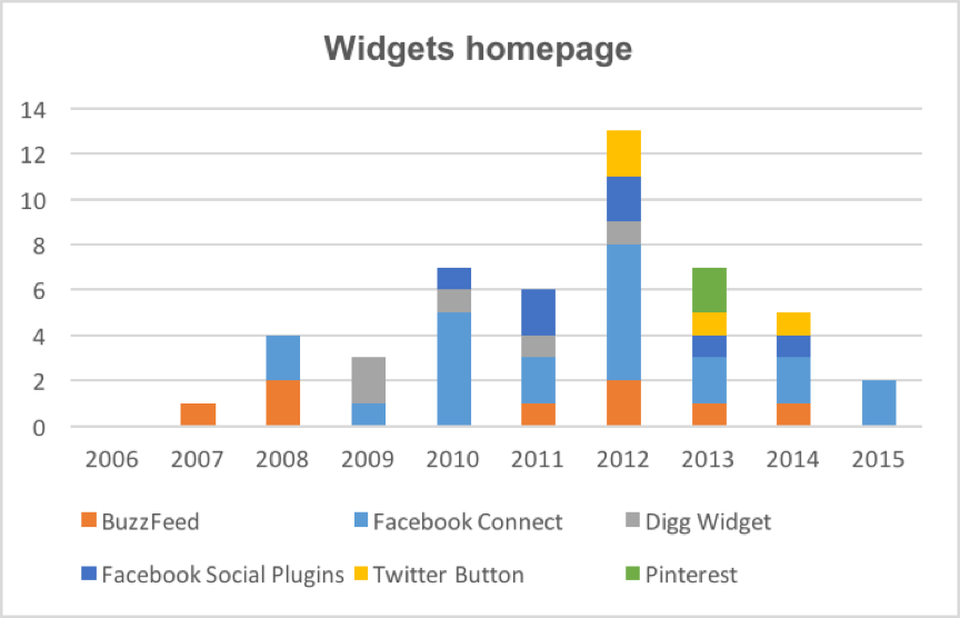
Widgets on the homepage

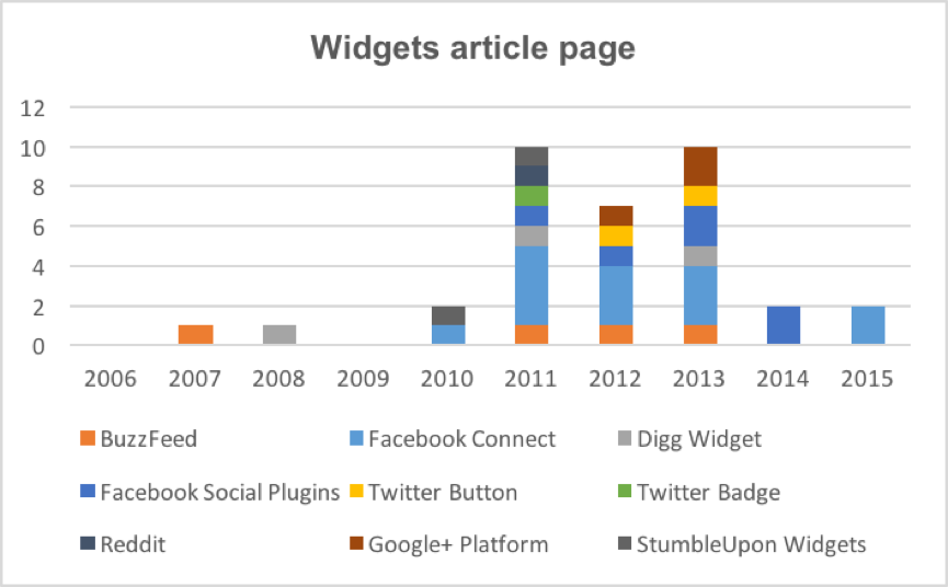
Widgets on article pages

Front-end analysis
In doing our research, we could establish four ‘era’s’ in which the evolvement of BuzzFeed ’s ‘social character’ becomes visible:- 2006-2008: The pre-social era of aggregating content;
- 2009-2010: Going Social or going viral?;
- 2011-2012: The social era - Shaping the present view;
- 2013-2016: Present view.
Conclusions
As could be expected, our interface analysis (front end) and social widget analysis (back end) more or less correlate with each other. Both reveal grains of social features at the end of 2008. Furthermore, both present a decline of social media widgets at some point in time. Especially from the back end findings, it becomes clear that social widgets have declined from 2014 and on. However, this does not per se mean a demise of social media within BuzzFeed as the interface analysis of the article pages shows an increase of social media share buttons within the article pages. Furthermore, over the years these buttons have become larger and more prominently visible within the article pages. In order to make a fruitful number critique we based our claims upon the idea of a continuing metrification system that BuzzFeed implemented from its first days of presence. Since 2006, BuzzFeed used all kinds of numbers, such as BuzzFeed stats, in order to stimulate user engagement and attract advertisers. Hereafter, BuzzFeed started to provide users with statistics of the everyday clicks, the clicks per week and per year, claiming that the web is a 24/7 popularity contest (buzzfeed.com 2007). Moving through the social era, BuzzFeed started to “score” the shares and likes each article had and made different sections focused on going viral, the top links and viral predictions based on metrics results. Thus, we could say that social engagement features created a metric value within a platformized web that expanded BuzzFeed in the social sphere.Discussion and relevant debates
- Numbers on the Platformized Web;
- Engagement;
- Digital Labor.
References
Rogers, Richard. Digital Methods. Cambridge, MA: The MIT press, 2013.| I | Attachment | Action | Size | Date | Who | Comment |
|---|---|---|---|---|---|---|
| |
Widgets_article_page.png | manage | 59 K | 27 Feb 2016 - 15:07 | FernandoVanDerVlist | |
| |
Widgets_homepage.png | manage | 50 K | 27 Feb 2016 - 15:08 | FernandoVanDerVlist |
Edit | Attach | Print version | History: r1 | Backlinks | View wiki text | Edit wiki text | More topic actions
Topic revision: r1 - 27 Feb 2016, FernandoVanDerVlist
 Copyright © by the contributing authors. All material on this collaboration platform is the property of the contributing authors.
 Ideas, requests, problems regarding Foswiki? Send feedback


