You are here: Foswiki>Digitalmethods Web>TheSpheres (14 Oct 2009, RichardRogers)Edit Attach
The Spheres
Spheres as way of thinking about the Web
Thinking of the Web in terms of spheres refers initially to the name of one of the most well-known, the blogosphere, as well as to scholarship that seeks to define another, the "Web sphere" (Foot and Schneider, 2002; Schneider and Foot, 2002). The sphere in blogosphere refers in spirit to the public sphere; it also may be thought of in terms of the geometrical form, where all points on the surface are the same distance from the center or core. One could think about such an equidistance measure as an egalitarian ideal, where every blog, or even every source of information, is knowable by the core, and vice versa. On the Web, it has been found, certain sources are central. They receive the vast majority of links as well as hits. Following such principles as the rich get richer (aka Matthew effects and power law distributions), the sites receiving attention tend to garner only more, however. The distance between the center and other nodes may tend only to grow, with the ideal of a sphere being a fiction, however much a useful one. Spherical analysis is a digital method for measuring and learning from the distance between sources on the Web.The object of study & the approach
Here a sphere is considered to be a device demaracted source set, i.e., the pure PageRank of all sources on the Web (most influential sites by inlink count), or indeed analogous "page rankings" of all sources calculated by the dominant engines per sphere, e.g., Technorati for the blogosphere, Google News for the newssphere, Del.icio.us for the social bookmarking or tagosphere, etc. Thus, to study a sphere, we propose first to allow the engines to demarcate it. In sphere analysis one considers which sources are most influential, not only overall but per query. "Cross-spherical analysis" compares the sources returned by each sphere for the same query. It can therefore be seen as comparative ranking research. The digital methods approach may also may be called "comparative source distance analysis." More specifically, for the query "climate change," the search engine, Google, returns an ordered list of sources. This list of sources may be thought of in terms of a bounded space. The question of which sources or actors are included, and which are excluded, is important. On top of questions of inclusion and exclusion, one may think about the type of sources returned. With cross spherical analysis the results served by Google Web search for "climate change" are compared to those returned by other ordering devices in the blogosphere, the newssphere, the tagosphere and perhaps the videosphere (YouTube).Initial observations would concern how each sphere-ordering device values digital objects in their algorithms. Consider for example how Technorati grants a different value to links than Google Web search. (See also the digital methods research on the no_follow tag.) The ordering devices, Google, Technorati, Google News, Del.icio.us and YouTube, define the source positions, and particularly the rankings, in the sphere. Most importantly, with cross-spherical analysis, one may think through the consequences of each engine's treatment of links, freshness, tags, etc. Do particular sources tend to be in the core of one sphere, and not in others? What does comparisons between sources, and source distances, across the spheres tell us about the quality of the new media?
Visualizing comparative source distance analysis
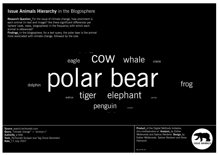
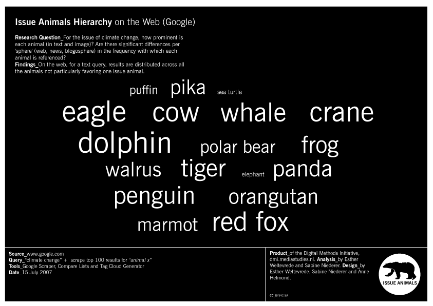
This unit is dedicated to cross-spherical analysis as well as the ways to visualize and interpret the results. One may start thinking about a sphere visually with the "unordered tag cloud." In the study, Issue Animals, animals (or actors) are presented visually in a sphere-shaped tag cloud, where the size of the text indicates the frequency of mentions. The visually bounded space represents the climate change issue animals space, consisting of the first 100 results served for the query "climate change." The animals are sized according to how many of the 100 websites mention each animal. Note that when comparing the results in the three spheres, the Web, the news and the blogosphere, the polar stands out in the news and even more so in the blogosphere (often described as being parasitic on the news). On the Web the animals are more equally proportioned, suggesting a more egalitarian space, at least in this case study.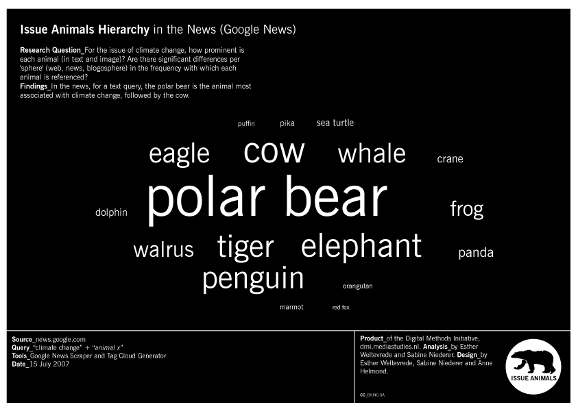
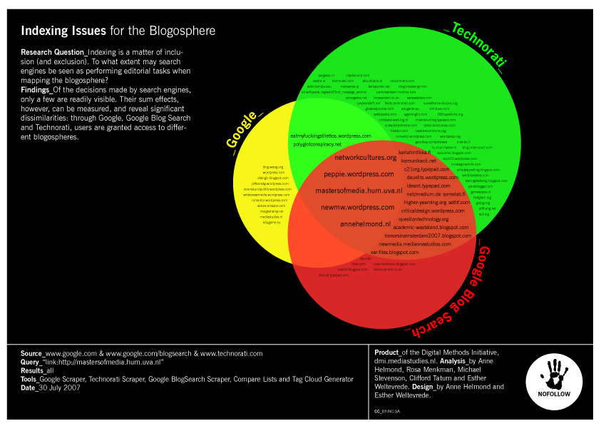
A second way to compare spheres is with a venn diagram. The cross spherical venn diagram can be viewed as the integration of multiple tag clouds in one graphic. This example study makes visible the three different blogospheres around http://mastersofmedia.hum.uva.nl. It shows which blogs are included or excluded within the spheres of the three devices we compared.
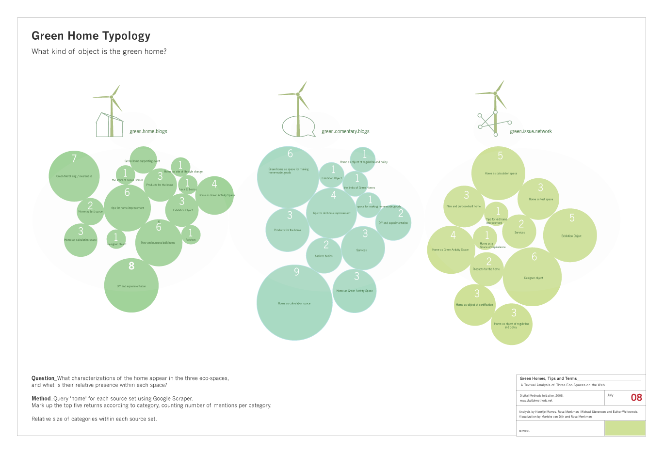
The third way to compare results across spheres is with dorling maps. The dorling is an alternative for the tag cloud and sizes bubbles (instead of words) according to the number of mentions. In the example of the green home topology, the dorling map is useful to visually present the composition of an issue space and compare its topology across source sets.*
*In this particular example the compared spaces are not based on ordering devices, but rather on three pre-defined source sets. Therefore it is technically not a cross-spherical example, though this visualization method can be used for cross-spherical analysis.
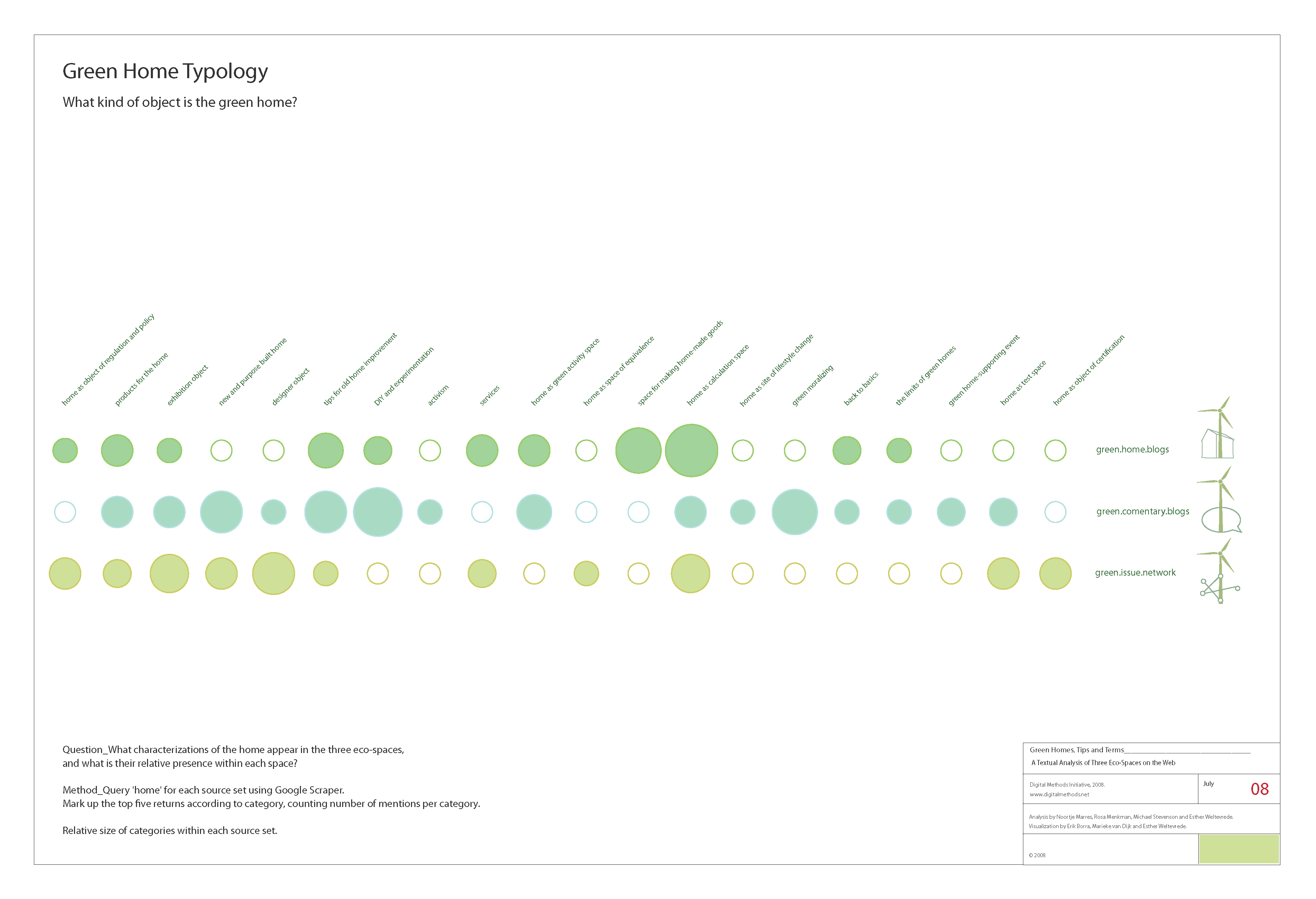
 The final example concerns the comparison of results in a bubbleline. Compared to the dorling maps, the bubbleline is an easier way to compare the occurrence of issue language across source sets. The example is based on the same data as that used in the dorling map.
Literature
Foot, K. A. and Schneider, S. M. (2002). "Online Action in Campaign 2000: An Exploratory Analysis of the U.S. Political Web Sphere." Journal of Broadcasting _& Electronic Media, 46(2): 222-244. Schneider, S. M. and Foot, K. A. (2002). "Online Structure for Political Action: Exploring Presidential Web Sites from the 2000 American Election." Javnost (The Public), 9(2): 43-60.Sample project: Issue Animals
Question
What is the hierarchy of Issue Animals in the climate change according to the web, the news and the blogosphere? Put differently, are the same Issue Animals popular in different "spheres" (where spheres are defined as distinct device-created spaces on the web)?Method for cross-spherical analysis
- Query Google Web search for websphere. Retain top hundred results for the query, "climate change". Query each of the 100 websites for each issue animal. Count how many websites mention each animal. One mention per website only.
- Query Google news for the newssphere. Retain top hundred results for the query, "climate change". Query each of the 100 websites for each issue animal. Count how many websites mention each animal. One mention per website only.
- Query Technorati for the blogosphere. Retain top hundred results for the query, "climate change". Query each of the 100 websites for each issue animal. Count how many websites mention each animal. One mention per website only.
Making a list of issue animals
- Endangered animal lists are taken from Greenpeace as well as WWF. In composing the list throughout the process we take into consideration the names of the animals should not be too generic, or too specific. For example, the term 'bird' returns too many results, whereas the more specific terms, 'eagle,' 'crane,' and 'puffin', return discrete results. Furthermore, the word 'fox' also returns Fox News results, so the 'red fox' is preferred over 'fox'. With respect to names' being too specific, the term 'whale' is preferred over 'right whale,' which is not widely used in entries about climate change unless they are by animal or environmental organizations. 'Cow' is the exception. 'Cow' was added to the list because image research showed cows are popular images in the climate change issue space, not as an endangered species, but as a cause of climate change due to the methane emissions from burping cows.
-
- "polar bear"
- "red fox"
- "sea turtle"
- marmot
- penguin
- eagle
- crane
- puffin
- walrus
- whale
- dolphin
- panda
- orangutan
- elephant
- frog
- tiger
- pika
- cow
Querying the Websphere - Google Web search
- Tools:
- Method:
- copy top 100 Google results "climate change" (incl ads) & paste in Scrape Google tool. Scrape Google top 100 returns for query "climate change" with animal x. Result files: IssueAnimals Cow RedFox SeaTurtle Marmot
- use Analyse/Compare lists tool to obtain a list of unique URLs per animal. Paste results from Scrape Google files per single animal (Excel>edit>paste special) as a unicode document in .xls. Select colomn d and paste URL lists in both 'list 1' as 'list 2' in Analyse/Compare lists. Settings: tick the following boxes: "TCI" urls (works like harvester); one url per line in both lists (excludes format options for list2 and removes harvest functionality from list1); only return hosts.
- Result: Ranking Issue Animals by number of mentions by single urls in the Google top 100 "climate change": Dmi.ResultIssueAnimalsGoogle
Querying the Newssphere - Google News search
- Tools:
- Method:
- scrape google news using Scrape Google News tool. search for one line per query "climate change" "animal x"
- result Scrape Google News file: climate_change_animals2result15Jul1209.txt
- Result: Ranking Issue Animals by number of mentionings in Google News related to "climate change": ResultIssueAnimalsGoogleNews
Querying the Blogosphere - Technorati blog search
- Tool:
- Method:
- Query technorati for blog posts on blogs with any, a little, some, and a lot authority: "climate change" + "animal x"
- Result: Ranking Issue Animals by number of mentionings in blogs with varying authority related to "climate change":
- Authority, any: ResultsIssueAnimalsTechnoratiAny
- Authority, a lot: ResultsIssueAnimalsTechnoratiALot
- Authority, some: ResultsIssueAnimalsTechnoratiSome
- Authority, a little: ResultsIssueAnimalsTechnoratiALittle
Cross-spherical analytical findings
- Google results are distributed across all the animals not particularly favoring one issue animal. Taking the other results in consideration, the low frequency of appearance of the polar bear is remarkable.
- Google news results show a preference for the polar bear. The second favorite animal is the cow. Since google news results are time based (oldest article is about a month old) favorite issue animals may change. The cow as cause of climate change being a news item may explain the high frequency of appearance. To do: Review google news results in a month to see if favorite issue animals have changed drammatically or not.
- Technorati favors the polar bear as issue animal as well. The range between most and least favorite issue animals are the most extreme in this sphere. We made a distinction between blog posts from blogs with varying authority to see if blogs with a lot authority had different favorite issue animals compared to blogs with little authority. This is not the case. Issue animal favorites are more dependent on sphere.
Edit | Attach | Print version | History: r12 < r11 < r10 < r9 | Backlinks | View wiki text | Edit wiki text | More topic actions
Topic revision: r12 - 14 Oct 2009, RichardRogers
Ideas, requests, problems regarding Foswiki? Send feedback