You are here: Foswiki>Dmi Web>WinterSchool2016>WinterSchool2016ProjectPages>ElectionTime (23 Jan 2017, JedeVo)Edit Attach
Election Time
Comparing Polarized News Platform Engagement on the US Presidential Election NightTeam Members
Jeroen de Vos, Annelies Bontjes, Jochem Bruins, Kajsa Klein, Liliana Melgar, Leoni NijlandContents
Summary of Key Findings
In light of the larger narrative of hope (and the loss of hope for Hillary supporters) during the 2016 US elections, this paper aims to provide an analysis of social media activity during the night of the election. The research question originates from two angles: first, the focus on polarized media and filter bubble critique, and, second, the idea that particular platform affordances influence the temporality of news narratives. More specifically, it looks at how a series of liberal and conservative news outlets engaged with the results of the electoral counting as they started to come in. We take as starting point a 2015 data journalism tool on ‘blue’ and ‘read’ news feeds, published by the Wall Street Journal, and look at each political side’s engagement with three important social network platforms: Facebook, Twitter, and YouTube. Our findings show a difference in timing between the conservatives claiming their victory and the liberals acknowledging their loss, and point at distinct forms of engagement at that particular moment which seems to relate to how the various platforms allow for different ways of expression.1. Introduction
As noticed by Pariser (2011), Google has since 2009 personalized its search based on personal profiles. When logged in, clicks, queries, and behaviour are tracked and saved creating data bodies: a data profile that promises to reflect online behaviour (Gillespie 2007). Algorithmically, these profiles are used to predict the user's behavior and filter the subsequent online experience. And Google is not the only party personalizing search results, a study shows that all major online companies providing internet services rely on similar filtering techniques to produce the supposedly most personal and relevant online environment. As a consequence, we are now finding ourselves in ‘echo chambers’ (Schulten, 2016), where the search results and status updates we see the attempt to reflect our own perception, opinion, and perspective.Democracy is nowadays built on the idea of having a public sphere where people encounter and express diverse opinions. However, some scholars (e.g. Rogers, unpublished) now argue that since we are not exposed to opposing opinions (Schulten, 2016), current online social spaces can not support the public sphere. Thus, this filter bubble has severe consequences for democracy and must be taken into account when evaluating the process in which citizens are asked to give their voice. In respect to the most recent U.S. presidential election, the filter bubble critique has become acute. Not only is there a widespread perception of both voters and journalists being increasingly caught up in their own echo chambers, there have also been well-documented instances of fake news achieving wide circulation.
The study presented in this paper hypothesizes that the two major political orientations in the United States, Liberal (‘blue’) and Conservative (‘red’), have different readings, as well as different ways of expression in online social networks, of the events happening that critical night: November 8th to November 9th when the 2016 Presidential election took place. It draws on the interpretation and explanation of a set of polarized liberal and conservative news platforms. We sketch out what the election night might have looked like through the eyes, or filter bubble, of a fictitious ‘red’ or ‘blue’ voter. This approach helps us answer the question of how can we understand the temporal advancing of the US Presidential election night reflected through the performance of polarized liberal and conservative media outlets.
2. Initial Data Sets
The selection of the polarized platforms on which we focus our attention is directly informed by the online tool made by the Wall Street Journal based on the study “Blue Feed, Red Feed: See Liberal Facebook and Conservative Facebook, Side by Side”, by Bakshy et al., (2015). In their research, anonymized Facebook users (ca. 10.1 million), who explicitly identified themselves with a political view, were tracked in order to identify the content they shared with a given political viewpoint. After categorizing these users as very liberal to very conservative, the researchers produced a list of most shared sources and then used this categorization to determine the political views of the Facebook pages. Their resulting list contains the Facebook pages of the most prominent ‘polarized’ news platforms. We used that list as a starting point for creating our main data sets for both “blue” and “red” Twitter account pages, Facebook pages and YouTube channels. In each case, certain procedures had to be adapted, because of the differences between the platforms, or because of the need to apply our selection criteria to existing datasets. For instance, for the Twitter platform analysis, we departed from the ‘US Election’ and the ‘US election night’ datasets provided by the Digital Methods Initiative in TCAT, and for the YouTube analysis, we also used a dataset harvested with the same criteria as the Twitter dataset for the same period. These procedures are explained in Section 4 as part of our dataset creation methods. The following is an overview of our initial datasets, which are also described in detail in Section 4:- Expert list: Facebook pages and harvested Facebook posts using the Facebook scraping tool Netvizz
- The Twitter dataset in the tool TCAT:
- US Election (general)
- US election night (subset)
- User-based caption
- YouTube activity dataset harvested using the YTDT “Video List tool"
3. Research Questions
How can we understand the temporal advancing of the US presidential election night reflected through the performance of polarized liberal and conservative media outlets? RQ1. To what extent is there one synchronized understanding of the election night events by both political sides? RQ2. How are the affordances of the respective platform shaping the attempts to communicate either a loss or a win situation?4. Methodology
Our study can be defined as cross-platform analysis using a mixed methodology. It is primarily done with a quantitative approach since we want to measure online social network activity of an initial sample of polarized media outlets in each platform. In addition, we make use of qualitative data (e.g., interpretations of the content of the posts) during certain parts of the research process. An important aspect of the methodology, as indicated in Section 2, is the selection of the research datasets for each online social media platform. We detail below the procedures that we used for the analysis of each resulting dataset. Two common elements were used for the content analysis of the posts in the three platforms (Facebook, Tweets, or Youtube).- A normalization of time. Because the US Presidential election night runs over different time zones we had to define what time span was to be included as “election night” and normalize all time-related data in the different datasets. We defined this period as the time spanning from 8th to the 9th of November, between 9 PM and 5 AM Eastern Standard Time (GMT – 5).
- A list of the key moments of the night of the election:
- 22.50 pm A.P. calls Florida for Trump
- 01.36 am A.P. calls Pennsylvania for Trump
- 02.30 am A.P. calls Wisconsin and the presidency for Trump
- 02.56 am Trump gives his acceptance speech
- The above key moments draws on the Washington Post (2016) narrative of the election night.
In the initial dataset (Section 2) there were 128 Facebook pages in total (60 blue and 68 red). We took a sample of 24 pages from this list based by ordering it from highest to lowest using the columns “fan count”, “average align”, and “side”. We selected the first 12 from each side (liberal and conservative). We chose a small sample with the purpose of having a better way to control our procedures. This implies though that there is a limitation in the conclusions we draw from this study. Using the Facebook scraping tool Netvizz (version 1.4.1), all posts from the time frame defined above were retrieved. The specific criteria we applied in the scraping tool Netvizz 1.4.1., with the following:
- Page data - creates networks and tabular files for user activity around posts on pages
- Facebook ID
- 2016-11-08 - 2016-11-09
- post statistics only (post metrics, stats per day and fans per country)
- get the post by page only
The resulting files included post content (text and URLs to pages, pictures, and videos), timestamps, the number of likes, and the number of shares. After retrieving the files for each page, all 24 files were merged into one spreadsheet. The side category side (red or blue) and page name were added manually to each row. After this, we checked the documents and corrected mistakes. We changed the timezone, creating a separate box for the Greenwich Time and Eastern Standard Time (-5/24) and filtered the data with the correct timespan of the election night (9 pm - 5 am GMT-5), separating blue and red Facebook posts. To get the final dataset, we filtered only the posts with a timestamp within the time span of the election night defined above. During this time period, 175 messages were posted on Facebook by those 24 accounts. Step 3 Working with the data - activity, pivot table and graph To be able to value the Facebook activity based on the data, we created a pivot table with the activity over time. We also created a graph viewing red, blue and total Facebook activity (Figure 1). Step 4 Working with the data - Facebook posts selection, visualisation
To be able to value the content of the data, we manually selected +/- 15 posts for each blue and red page that represented the decisive moments during the night. These posts were turned into a gif which reflects the narrative of the election. Furthermore, with the aim of analyzing the posts’ length, in order to compare, for instance, with Tweets’ message lengths, we created a column in Excel with a formula to measure the amount of words: =LENGTE(SPATIES.WISSEN(F2))-LENGTE(SUBSTITUEREN(F2;" ";""))+1
For obtaining the Twitter dataset, we used both the ‘US Election’ and the ‘US election night’ initial datasets provided by the Digital Methods Initiative in TCAT which showed that approximately 80% if the sample outlets had a Twitter account. However, because of a general throttle problem with scraping the tweets, almost no tweets from these sources could be found for the original (24 web pages) sample. Therefore, we decided to retrieve all the latest tweets from the accounts found on the initial list (blue/red) mentioned above. Because the list from The Wall Street Journal only contained Facebook URL's, the corresponding Twitter pages had to be identified manually. Finally, 114 accounts (57 blue and 57 red) were found. Step 2 Transfer data to Excel
After scraping their complete twitter feed from the web, we created an Excel document with T-CAT consisting of the selected tweets. We changed the time zone, creating a separate box for the GMT one and another for EST (-5/24). Next, we filtered the tweets that were posted on election night within the time frame defined above. In total, 1660 tweets were posted that night. After adding the side (red or blue), the dataset was ready for analysis. Step 3 Working with the data - graph and activity
We wanted to look at the activity over time, so we first made two graphs using T-CAT, which showed the activity of the tweets for the liberal (blue) and the conservative (red) outlets. Our designer made a new graph where those activities came together (Figure 1). After that, we zoomed in into important tweets at the crucial moments and compared the activity for the blue and the red outlets. Step 4 Working with the data - tweet selection, visualisation
To be able to value the content of the data, we manually selected +/- 15 posts for each blue and red outlet that represented the decisive moments during the night. These tweets were turned into a gif reflecting the narrative of the election. Our designer made two video’s: one with a Twitter timeline of the blue side and one with a Twitter timeline of the red side (see Findings section).
Facebook & Youtube Videos
Step 1: YouTube activity in polarized news outletsOur goal was to identify the YouTube activity of the 24 news outlets from the “Red feed blue feed” study. We were interested in a number of videos posted and in user engagement. To analyse the YouTube activity from the 24 page sample (see Facebook data set above), we checked manually if they had corresponding YouTube channels, by searching both via YouTube and in their ‘own’ webpage: 21 of the 24 had a channel we could find. After obtaining the channel ID, we used the YTDT “Video list” tool provided by the Digital Methods Initiative (v1.04 - 01/02/2015) to retrieve all the YouTube activity during the election night. We analyzed the activity for each channel defining YouTube activity as the number of videos posted during the time frame. A quick look at the data showed low activity in the channels. There were only 13 videos uploaded by these 24 sites in the entire night, 8 of them originating from only one site (namely the liberal television network MSNBC). For this reason, we did not work with this data set in the final analysis, but with the two datasets obtained in Steps 2 and 3, described next. Step 2: Videos shared in Facebook pages of the 24 top polarized sites: Because of this lack of activity, we decided to also look directly at the Facebook activity of each page in the initial (24 page) sample in relation to videos. To construct a dataset we selected all Facebook posts of the type “video” using the Facebook spreadsheet described above resulting in 32 (video) posts. Four videos were unrelated to the US election and thus removed. The final dataset contained 28 videos. Step 3: YouTube activity during the night of the election The low video-related activity by the pages in our sample prompted us to further extend the study with the goal of gaining a better understanding of the general YouTube activity during the night of the election. For this purpose, a second data set was created. Using the YTDT “Video List tool" we used the search query “Trump” OR “Clinton” OR “Hillary”, in 50 iterations. The Video list was then limited to include videos published during the common time frame defined above, resulting in 439 videos after removing duplicates. These terms were the same terms used to harvest the initial Twitter dataset that was provided by the Digital Methods Initiative. An extra column was then added to the dataset to indicate ‘YouTube engagement’, which we defined as the number of views plus number of comments, likes and dislikes per video. Step 4: Content analysis
We manually categorized the videos in the top 10 of the list according to:
- Type of video producer outlet (news outlets, non-news outlets)
- If the news outlets were polarized (red/blue). For this, we checked if these videos were published by or had content from (were remediated by) any outlet in the original list of red/blue (24 list).
5. Findings
This section includes the main findings per platform, as follows:We have created various graphs showing the Facebook posts (activity) per half hour. In the graph below the amount of Facebook posts for both the liberals and the conservatives is reflected.
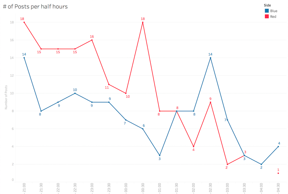 Figure 1. Facebook activity
Number of Facebook posts issued by a sample of liberal (blue) and conservative (red) outlets during the US Presidential election night
Figure 1 shows how the conservatives have more posts (18 per half hour) than the liberals (14 per half hour) in the beginning of the time frame. For the liberals, there is then a peak at 23:00h (16 posts per half hour), which is just minutes after Associated Press officially announced Trump’s victory in Florida (which was at 22:50h). At 01:30h the amount of Facebook posts is the same for liberals and conservatives (8 posts per half hour), at this time the Associated Press called Pennsylvania for Trump. After this point, the Facebook posts of the liberals exceed the number of posts by the conservatives, with a peak at 02:30h (14 posts per half hour). This was the time, the Associated Press called Wisconsin for Trump, which gave him the required 270 electoral votes, meaning Trump won the election. A final notable point, where both lines cross, comes at 03:15h (3 posts per half hour). That was the time when Trump delivered his acceptance speech. Results Facebook content:
Concerning the content of the Facebook posts, we have made a manual selection of +/- 15 posts that provide an overview of how the evening was experienced. This selection was made based on the four decisive moments indicated above (see the beginning of Section 4).
The posts were put together in two gifs (one for the liberal websites and one for the conservative websites). The gifs show screenshots of the chosen posts with a time clock that starts at 21:00h and ends at 03:25h, including text when a decisive moment is reached. Figures 5 and 6 show two examples of the gifs.
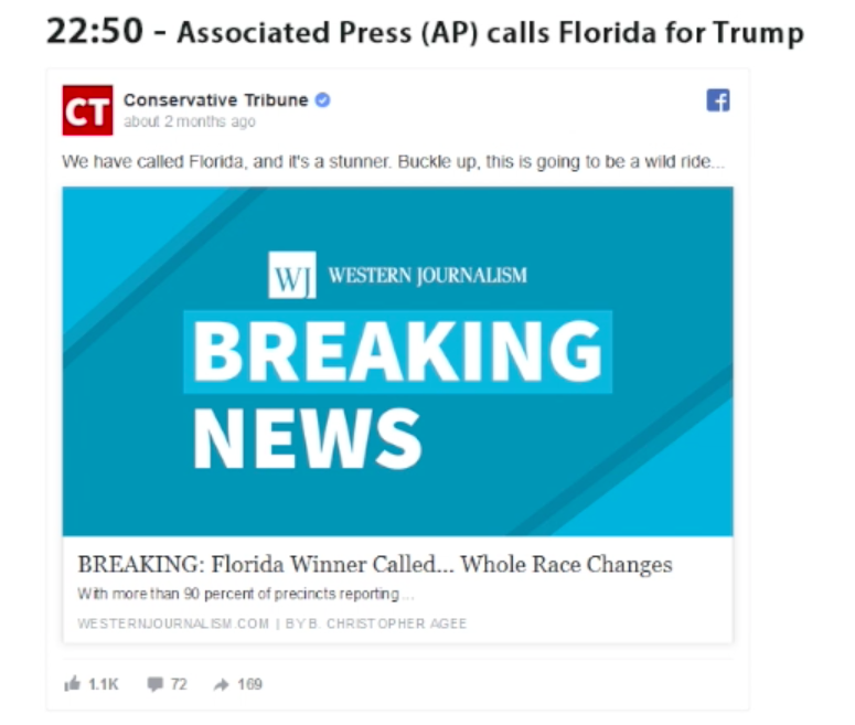 Figure 2. Facebook content example (red)
Example of a post issued by a conservative (red) polarized outlet during one of the decisive key moments of the US election night
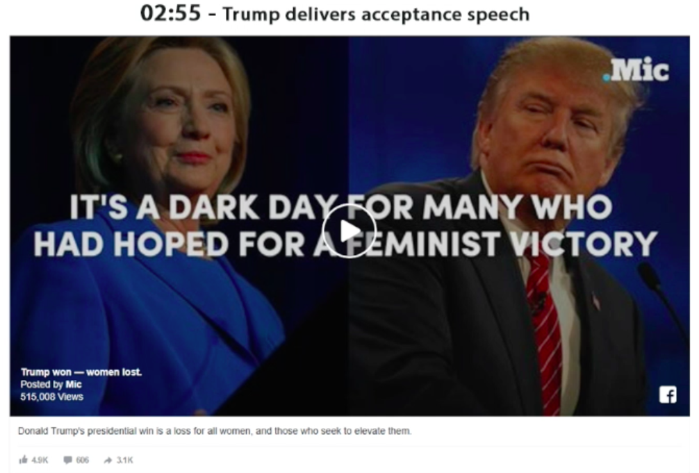
Figure 3. Facebook content example (blue)
Example of a post issued by a liberal (blue) polarized outlet during one of the decisive key moments of the US election night
Twitter activity reflected the sentiments of the night very well. This can be seen in Figure 4, where the frequencies of Twitter posts of blue and red outlets are shown together.
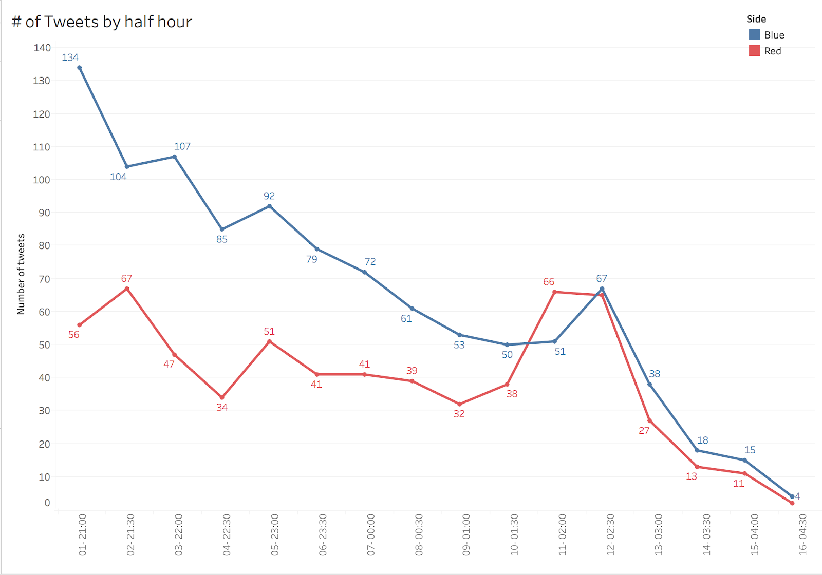
Figure 4. Twitter activity.
Number of tweets posted by liberal (blue) and conservative (red) outlets during the US Presidential election night The evening started with more tweets from the liberal outlets (134 tweets per half hour) than the conservatives (56 per half hour). As can be seen in the figure there is then a peak at 02:30h for both the liberals and the conservatives. The amount of tweets is more or less the same for both parties (67 posts per half hour). This is the time when the election was called for Trump. Results Twitter content:
Concerning the content of the tweets, we have made a manual selection of the +/- 15 posts that could best illustrate how the evening was experienced. This selection was made while having the four decisive moments in mind (see the introduction to Section 4). The posts were put together in two gifs (one for the liberal outlets and one for the conservative outlets). The gifs show screenshots of the chosen posts with a time clock that starts at 21:00h and ends at 03:25h, including text when a decisive moment is reached. Figures 5 and 6 show two examples of the gifs.
 Figure 5. Twitter content example (blue)
Example of a post issued by a liberal (blue) polarized outlet during one of the decisive key moments of the US election night
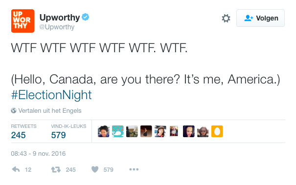
Figure 6. Twitter content example (blue)
Example of a post issued by a liberal (blue) polarized outlet during one of the decisive key moments of the US election night Via a couple of examples, we can illustrate how certain tweets suggest that the evening started out on an anxious note (figure 5) but that the reaction from the liberals when it was clear that Trump was the winner was of shock: “WTF WTF WTF” (figure 6.). Further sentiment analysis research is necessary to confirm these “tones” though.
Facebook Videos & YouTube activity
Facebook Videos The final dataset of Facebook posts by the 24 news outlets in the sample which included videos consisted of 28 video posts. Compared to the general YouTube activity (which is described later), this represents a lower level of video publishing related activity. Figure 7 shows the distribution of those 28 video Facebook posts during the election night.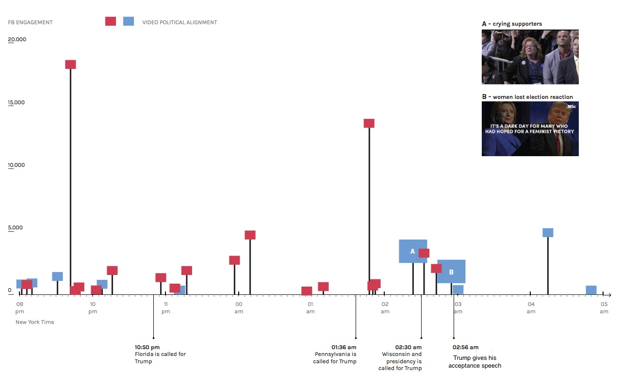 Figure 7. Facebook video-posts activity
The number of Facebook posts which included video issued by a sample of liberal (blue) and conservative (red) outlets during the US Presidential election night. The Y axis indicates the level of engagement (as defined in Section 4). In relation to content, most videos (24 out of 28) contained news reporting and live commentary. Some were several hours long, others were short clips, such as a video featuring crying Hillary supporters. The few exceptions to the live content included a Hillary hate video by the Daily Caller published after the election was called for Trump and a Mic video with a feminist message about how Trump won and women lost the election. The high ratio of live commentary during election night is notable (higher peaks in Figure 7) but not really surprising. As Figure 7 shows, 10 of the Facebook pages posting videos were blue and 18 red. However, since 6 of the 18 red pages were long or short versions of the live commentary/news reporting of the Western Journalism outlet published either on Western Journalism’s own page or on the Conservative Tribune page, and another 6 videos had live commentary from the Daily Caller, the variation of content was actually quite limited. This could be considered as an example of the conservative echo chamber. Finally, worth noting is one methodological difficulty analyzing video engagement: for our study we only took into consideration the precise moment in which a video was published and the user activity around them – however, since the length of the videos differs, this should ideally be included as an additional factor in measuring engagement. It is difficult to know, however, if a user has watched a video from beginning to end before “liking” it or commenting it so this dimension is lacking here. This influences what could be interpreted from Figures 7: if we take into account the duration of the most watched videos, it is likely that a substantial part of the user engagement happened later, sometimes 2-3 hours into the video streaming perhaps corresponding better with the key moments. YouTube activity and most engaged videos
 Figure 8. YouTube activity
The number of YouTube videos posted during the US Presidential election night. The Y axis indicates the level of engagement (as defined in Section 4). Figure 8 shows the most engaged with videos of the night. The highest peak, the video that achieved most user engagement featured Stephen Colbert’s reaction to the election results. Colbert/Showtime was not part of the polarized selection, thus, in this case, mainstream (and a comic take on the election) trumped red and blue. Also in the top ten list were various broadcasts of Trump’s acceptance speech at his victory party. Interestingly enough, this category included, as the third most engaged with, a video uploaded by the Russia Today channel. US Elections, though national, can be considered global media events (Dayan & Katz, 1992; Couldry, Hepp & Krotz, 2010), and Russia played a key role in the 2016 election. Other non-US outlets in the top ten included the Canadian CBC news and the Guardian. The red and blue outlets were not in the top ten with the exception of Fox news (featuring yet another live broadcast of Trump’s speech).
The majority of the videos that were most engaged with were published after the presidency was called for Trump.
6. Discussion
After the previous analysis, we can clearly see a difference between the platforms, both in terms of activity and, occasionally, in terms of content. When comparing Facebook to Twitter, we can see a higher level of Facebook activity from the liberal outlets than the conservative, but the opposite occurs in Twitter. A reason for this might be found in the structure of the message that each platform allows for. For Twitter, a tweet has a maximum of 140 characters, whereas for Facebook there is no word limit. Feelings of joy, victory or happiness (for the conservatives) are straightforward emotions that take few characters to express. For instance, in analyzing the tweets of the conservatives there were many that expressed simple onomatopoetic or affirmative sounds, such as ‘WOW’ or ‘Yes!!’. Feelings of sadness, misery, and despair (for the liberals) are more complex emotions and therefore take more characters to express. This could be one of the factors that may explain the difference in Facebook/Twitter activity for both parties, but it needs further research to be confirmed in a bigger sample. We thought Twitter and Facebook would show a reflection of the key election night moments defined in our study (Section 4) both in their content and in the amount of tweets/posts, but this was not the case. On both social media platforms, very conflicting messages were shown. For instance, at 22:10 p.m. the conservative outlet Political Insider called Florida for Trump but it was not until almost another hour until this outcome was officially confirmed. There are many other examples which must have lead to certain confusion and diversion among the people following the 2016 US election night through Facebook and Twitter. In relation to the video sharing platform YouTube, the study suggests that even though there was quite a lot of user engagement with videos posted on the platform during election night, this was not the preferred medium for sharing content by the polarized outlets in our sample. They were actually somewhat more active sharing videos on Facebook. YouTube video activity during election night was remarkably similar to traditional media experiences during comparable election spectacles (Kellner, 2010) in that engagement with streamed live commentary and news provided by television broadcasters dominated. This is how Kellner (2010:15) describes the typical U.S. election viewer experience:“Election night is always a major political spectacle when the country, and parts of the world, watch the election results come with maps flashing new red and blue colors on the states, with the exciting swooosh of Breaking News!, followed by results and trends of the election in the inevitable countdown for a candidate getting the magic number of votes to gain the presidency.”On YouTube, precisely this type of remediated television broadcast content dominated. This phenomenon provides evidence of the challenge that television broadcasters are facing with the increasing use of online video and social video platforms. In a recent debate, the “EU Presidency conference on Promotion of Cross-Border Circulation of European Audio-Visual Content” held on March 3 and 4 in Amsterdam, the Netherlands, the future of television was high on the agenda because of this shifting media production and consumption phenomena. Social media platforms can serve as alternatives to the television set. At the same time, our study points at remediation practices and more specifically to the continued influence of the traditional broadcast election spectacle form. Kellner (2010:6) argues that elections can be seen as a form of media spectacle orchestrated by the state. This, however, does not mean that they are necessarily strictly national events. The fact that several of the most engaged with-YouTube videos of our sample were posted in non-U.S.-media channels suggests a substantial global interest. A quick (and in no ways scientifically satisfactory) look at the content of the videos, however, leads us to suspect that the 2016 election night was less of a global spectacle than the 2008 Obama Election Kellner analyzed. We encountered little on YouTube in the way of the global celebration that Kellner described on that occasion:
“Television networks showed the spectacle of people celebrating throughout the United States, from Times Square to Atlanta, Georgia, and even throughout the world. There were special celebrations in countries like Kenya and Indonesia where Obama had lived and his former residencies in these countries were becoming national shrines that would be tourist destinations. Obama was indeed a global spectacle and his stunning victory would make him a world superstar of global politics.” (Kellner 2010:16)Further comparative qualitative research is needed to explore what makes an election event a “global spectacle” as Kellner calls it, in the era of online social networks, and also to with any certainty rule out that the YouTube videos of our sample completely lacked such content. Finally, it could also be interesting to look into the engagement surrounding, for example, the Russia Today channel we observed as part of the YouTube activity of the night to see if any interesting patterns can be identified.
7. Conclusions and Future Work
To shortly recap, the research question we started with was the following: How can we understand the temporal advancing of US Presidential election night reflected through the performance of polarized liberal and conservative media outlets? Our analysis shows that the engagement with the election events of the group of polarized news outlets differed. This is not to say that there are coherent distinguishing factors between the ‘blue’ and the ‘red’ outlets, instead, the activity inside each group varied greatly. However, making a timelapse of what the night would look like through the eyes of these platforms, offers us insight into how the respective ‘red’ and ‘blue’ outlets’ appeal to different textual and visual vocabulary. Taken together, there did not seem to be a synchronized understanding of the events that happened that night. There were examples of how the publishing of a particular event was dispersed in timing. Concerning the “moment of truth”, the conservatives were about half an hour early in their activity on Twitter, peaking around the news that Trump has won, whereas the liberal outlets took more time to publish the news. Also content wise, it seemed as if the conservatives were more active on Twitter at the moment their victory could be claimed. Interestingly, this finding corresponds to the fact that the liberals were most active on Facebook the moment their loss needed to be acknowledged. This leaves us with the suggestion that, perhaps the affordance of the respective platforms facilitate different forms of emotions. Perhaps you need fewer words to claim your victory than to formulate your loss. Besides the issues indicated in the previous section, our findings raise much more questions for future research, for example, about what the specificity of a social media platform is in relation to other media types. We have for instance seen that videos are not only shared via a dedicated medium-platform such as YouTube but also via Facebook. Is this multi or cross-modality going to increase? Is the content of the videos shared in one dedicated platform different from the content of the videos shared in another non-medium specific platform? What types of content result in high levels of engagement when there are major political events? Is it mostly live commentary as is the case in our study of election night activity? In relation to the form of the message (as we observed that this could have been a possible factor explaining why Twitter activity was higher than Facebook activity), more research needs to be done to understand if the platforms’ affordances at this level are more inviting for certain forms of activism before or during decision-making events, and also on how the way a platform is built influences the citizens` choices.8. Limitations
In our cross-platform analysis we ran into one particular question that needs mentioning: when can content over platforms be compared? In other words, what methods and/or variables are needed to make a good comparison? The multiple platforms have their own technicalities, and infrastructure which inherently restricts the possibility of comparing directly. A retweet is simply not the same as a ‘like’ on Facebook in terms of affiliation, engagement and (social) performance. Thus, the lack of a comparable matrix accounts for one of the limitations of this research. Instead, we chose to compare their content in terms of aesthetics and imagery, length (in terms of characters or words) and most importantly, timing in relation to key moments of a live event. With the temporality aspect as a key feature of our analysis, traceable, accountable and comparable time over all three platforms was a necessary requirement. In practice, timestamps on the content of messages are highly dispersed, due to the technical reality that different servers process the published messages, each attributed with the time of the respective server. These servers are spread over time zones which do not have to conform to the location of the ‘publisher’ of the front-end of the website. Therefore, the standardization of time is a key issue in the analysis of online social media activity during live events, not only because they span over different time zones, but because people may engage differently with live events depending on their personal daily routines. For people in other parts of the world, the real feelings of loss of hope may have come after waking up the day after.9. References
Bakshy, E., Messing, S., & Adamic, L. A. (2015). Exposure to ideologically diverse news and opinion on Facebook. Science, 348(6239), 1130–1132. Barber, G., Shapiro, Leslie, Jiang, Ling, & Han, Sam. (2016, November 11). An election night of discontent - Washington Post. The Washington Post. Retrieved from https://www.washingtonpost.com/graphics/politics/2016-election/election-night-emotions/ Couldry, N., Hepp, A., & Krotz, F. (2009). Media events in a global age. Routledge. Retrieved from https://books.google.nl/books?hl=nl&lr=&id=pHFeBwAAQBAJ&oi=fnd&pg=PP1&dq=Couldry,+N.,+Hepp,+A.+and+Krotz,+F.+(2009)+Media+Events+in+a+Global+Age&ots=GC9zf-Peu-&sig=RLb15JeXsxNHfvHhwqvFK23taaQ Gillespie, T. (2014). 9 The Relevance of Algorithms. Media Technologies: Essays on Communication, Materiality, and Society, 167. Katz, E., & Dayan, D. (1992). Media events: The live broadcasting of history. Cambridge, MA: Harvard UP. Keegan, J. (n.d.). Blue Feed, Red Feed. Retrieved 13 January 2017, from http://graphics.wsj.com/blue-feed-red-feed/ Kellner, D. (2010). Media spectacle and media events: Some critical reflections. Media Events in a Global Age, 76–91. Kessler, F., & Schäfer, M. T. (2009). Navigating YouTube: Constituting a hybrid information management system. The YouTube Reader, 274. Pariser, E. (2011). The filter bubble: What the Internet is hiding from you. Penguin UK. Retrieved from https://books.google.nl/books?hl=nl&lr=&id=-FWO0puw3nYC&oi=fnd&pg=PT3&dq=pariser+filter+bubble&ots=g3OqDmuUR0&sig=-Cww6NBJgyUh-8TtDs7JAGldbx4 Pariser, E. (n.d.). Beware online ‘filter bubbles’. Retrieved from https://www.ted.com/talks/eli_pariser_beware_online_filter_bubbles Rieder, B. (n.d.). Youtube Data Tools (Version 1.0.4). Retrieved from https://tools.digitalmethods.net/netvizz/youtube/ Rogers, R. (2016, November). Public Sphere or Filter Bubble?. Unpublished presentation. Schulten, K. (2016, September 29). Is Your Online World Just a ‘Filter Bubble’ of People With the Same Opinions? The New York Times. Retrieved from https://www.nytimes.com/2016/09/29/learning/is-your-online-world-just-a-filter-bubble-of-people-with-the-same-opinions.htmlEdit | Attach | Print version | History: r1 | Backlinks | View wiki text | Edit wiki text | More topic actions
Topic revision: r1 - 23 Jan 2017, JedeVo
Ideas, requests, problems regarding Foswiki? Send feedback