You are here: Foswiki>Dmi Web>WinterSchool2017>WinterSchool2017ProjectPages>WinterSchool2017BeyondTheBubbleImages (16 Jan 2017, LisanneBlomberg)Edit Attach
A Picture is Worth a Thousand Words
A Visual Analysis of the Liberal and Conservative Filter Bubble This project is one part of the larger Winter School 2017 study Beyond the bubble? Exploring the 2016 US election echo chambersTeam Members
Lisanne Blomberg, Taylan Engin, Sammie Peters, Janna van Strien and Stefanie VoortmanContents
Summary of Key Findings
By analyzing the most engaged images from liberal and conservative Facebook pages, a general image of the two bubbles can be given. The red and the blue bubbles have to be seen as issue filter bubbles. They both focus on very different topics. In both issue filter bubbles, there is a lot of disparaging each other, but the conservatives are bashing the democrats a lot more than the other way around. On the republican side, a Trump-bubble is existing. On the democratic side, there is not really a Hillary-bubble, but a liberal bubble instead.1. Introduction
During the American election period, a lot has been written about the existence of an information bubble or a filter bubble. The Wall Street Journal Blue Feed, Red Feed project shows two Facebook feeds based on the news shared by well-known liberal and conservative media. The big differences between the feeds that liberal and conservative voters see, asks for more research on the bubble that conservatives and liberals live in on social media. One way to build on this research is to give these two different online groups, or these two bubbles (the liberal and the conservative), a face, representing a general image of these two bubbles. By giving the bubbles a face, we hope to give a better understanding of these bubbles themselves and a better understanding of the differences or overlaps between them. For creating these faces, we used the images shared or posted in several liberal and conservative Facebook pages. We hope to give a less abstract and more concrete explanation of the ‘bubble ’theory.2. Initial Data Sets
The Facebook pages of which we extracted the images, are based on the Blue Feed Red Feed project by Wall Street Journal. Their aim was to how reality may differ for different Facebook users. The Facebook pages are significant in their liberalism or conservatism, because during the collecting of the pages they are all thoroughly analysed.3. Research Questions
What has been written above, leads us to the research question: What do filter bubbles look like when we take images as their starting point? We expected to find overlap in a few topics. We thought that both sides would be interested in the same themes but would have different opinions about it. We also expected that there would be a lot of bashing towards the other side.4. Methodology
The Wall Street Project “The blue and red feed” served as a starting point for our analysis (Keegan, 2016). This project selected the 129 most liberal and most conservative Facebook pages. From that list, we detracted the ten most liberal and ten most conservative Facebook pages (see list below). It might have been even better to use the images shared on individual Facebook pages, because that would give an overview of how voters themselves actually think. However, since that is not possible because of the Facebook API, we decided to use liberal and conservative pages instead. When the twenty Facebook pages were selected, we used the Netvizz v1.41 tool to do an image analysis. With the function ‘page timeline images’, we got all the images that were shared or post by these pages. For all these pages, we selected the ten most engaged pictures for a certain timespan, engaged meaning the most liked, shared and commented images. The chosen time span was the 11th of October 2016 till the 8th of November 2016 (election day). When there weren’t enough pictures on a page timeline in this timespan, we took the most engaged pictures from the 1st of January 2016 till election day. When we had selected the most engaged pictures, we categorized them. The categories were based on the images that were selected. For the liberal side, we created categories such as ‘Rainbow Society’, ‘Celebrities’ and ‘The Other’ (meaning the conservatives), for the conservative side we created categories such as ‘Pro-Life’, ‘Security’ and ‘The Other’, (meaning the democrats). With these images and categories, we could analyze the results and make visualizations of these results.5. Findings
The most important finding of our research is that it is best to consider the filter bubbles as an issue filter bubble. On both the democratic and the republican side, they’re concerned with very different topics and themes. They do not really refute the arguments of the other side, but instead focus on other issues. For example, on the conservative pages, a lot of images focus on the Pro Life issue. It might be expected that the liberal pages would then focus on the Pro Choice Issue, but they do not. Instead, they post many images of gay rights and the rainbow society they stand for. Both sides are referring to ‘the other’ in their images. On the conservative pages, there are many images in which they refer to Hillary and the democrats in a blaming or sarcastic way. The liberal pages do the same thing, by posting pictures of Trump, but they do it less than the conservatives. Something else that was confirmed by analyzing the images is that both sides, especially the liberal side, were not completely satisfied with their own candidate. This shows that the Hillary-bubble is non-existent, it is more a liberal bubble. We detected two bubbles, best called issue bubbles. However, there is also one overall bubble in which they all reunite: the focus on their own country. There is barely posted anything about issues outside the United States.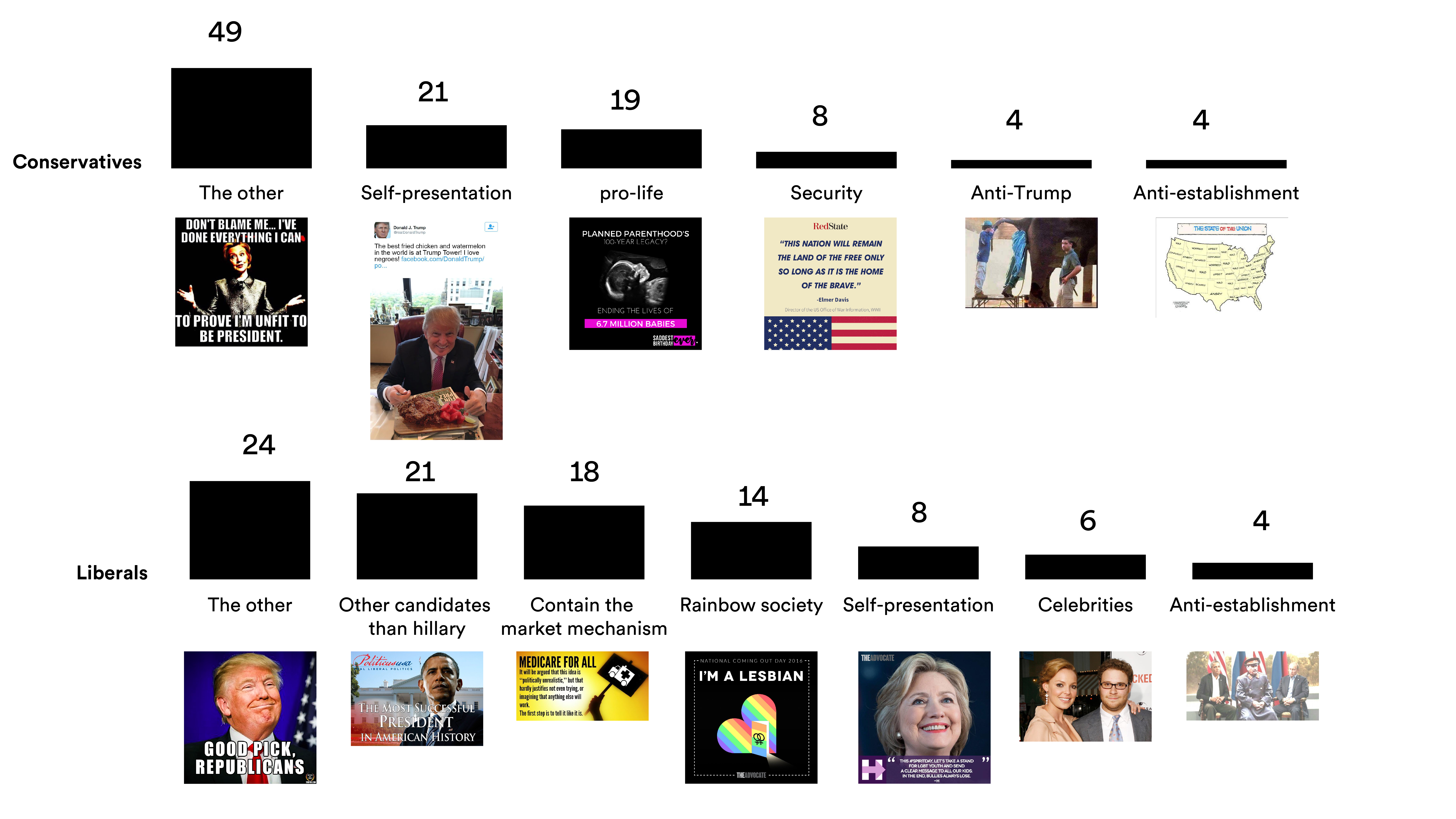 Figure 2: This visualization shows the size of the different categories per political side, it illustrates how they are engaged with different issues. (Credits: Gabriele Colombo)
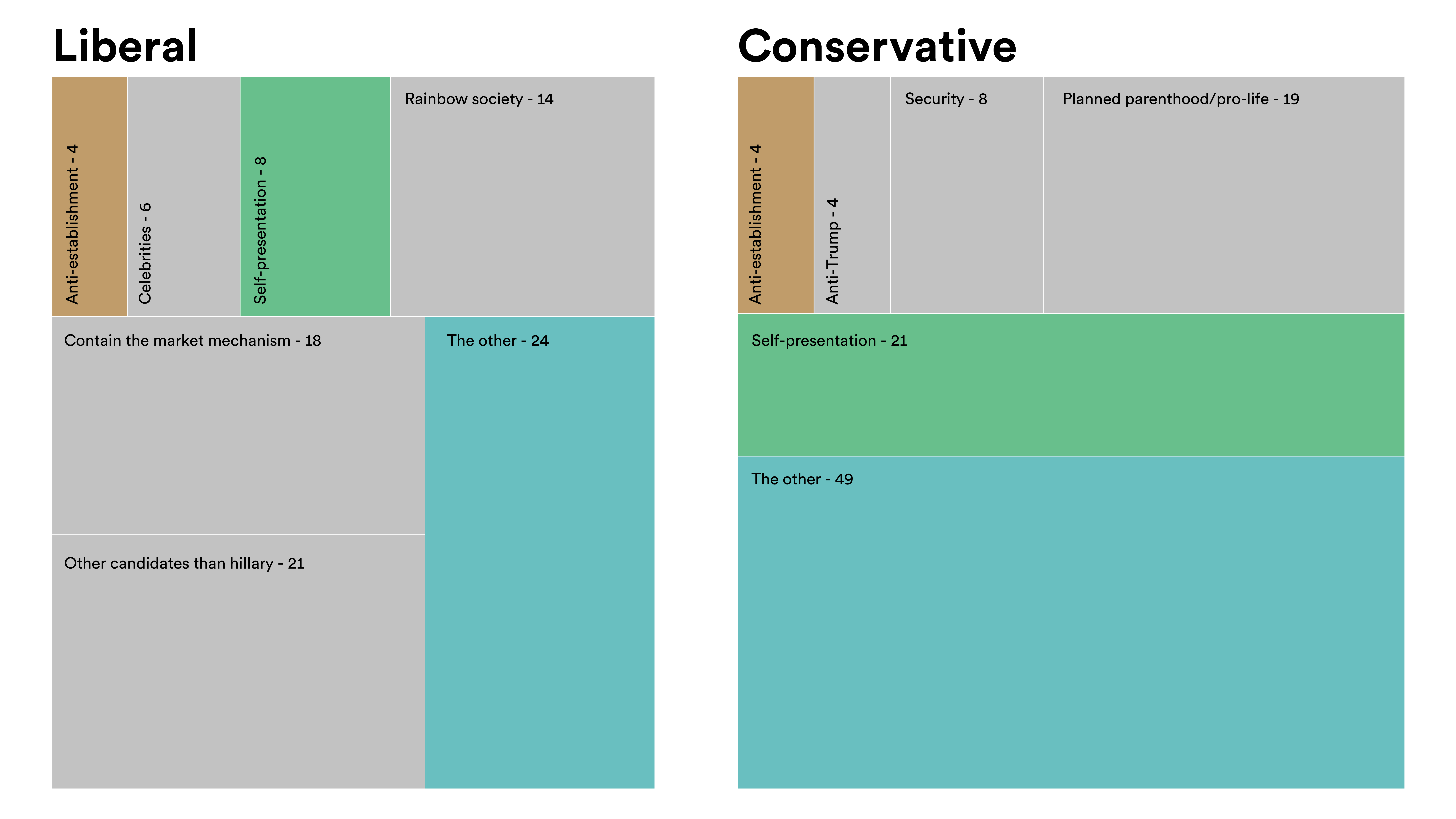 Figure 3: Treemap that shows there are hardly any common topics, the ones with the same colors represent the categories with the same names. It can be seen that the categories differ in size and that most categories are grey, which means they do not correspond with any categories from the other side. (Credits: Gabriele Colombo)
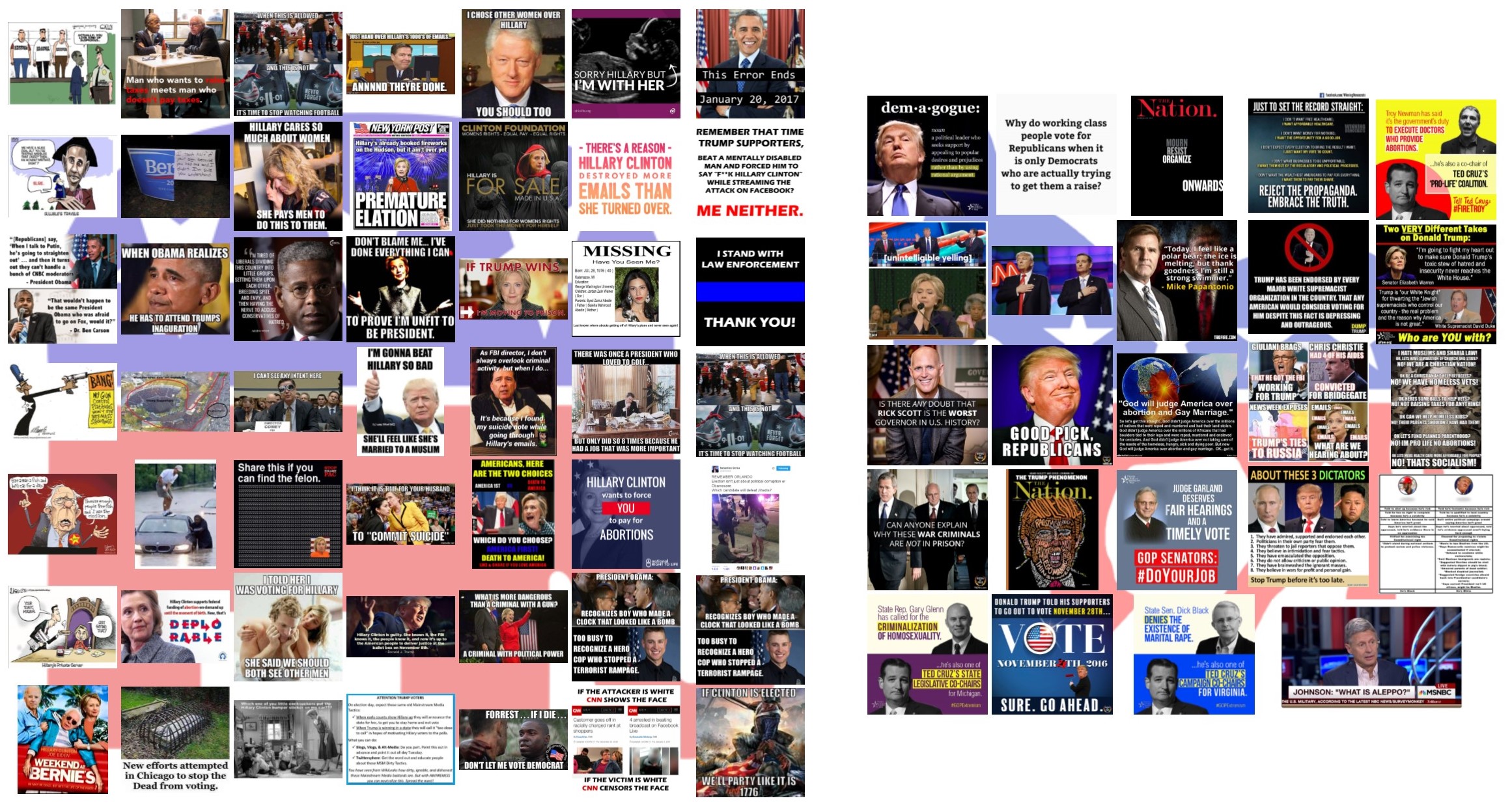 Figure 4: Collage of all the images of 'The Other' categories, on the left are images of the conservative side, on the right are images of the liberal side. This collage shows how both sides disparage the other side, and that the conservative side does this more.
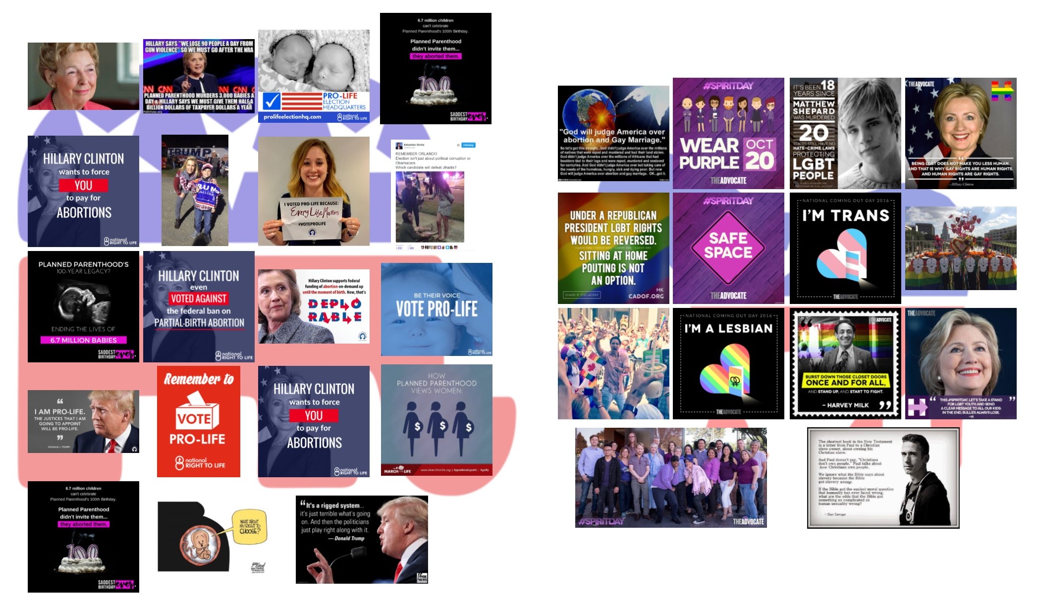 Figure 5: Collage of images of both sides' main issues. On the left is the conservative side with images of the 'Pro-Life' category, on the right are images of the liberal side with images of the 'Rainbow society'.
.png) Figure 6: The themes of the issue filter bubbles visualized. The size of the words correspondents with how many times they are depicted in the images. The left bubble shows there is not really a Hillary-bubble, but more a liberal bubble.
Figure 6: The themes of the issue filter bubbles visualized. The size of the words correspondents with how many times they are depicted in the images. The left bubble shows there is not really a Hillary-bubble, but more a liberal bubble.
6. Discussion
Since we have selected the most engaged with liberal and conservative images, it would be a next step to do a qualitative content analysis of these images, in that way much more can be said about them. Furthermore, the original time frame that was chosen of four weeks before the election day turned out to be not long enough, because of this we had to select some images that were not within this time frame. The time period could have been chosen more concrete, leading to a more equal image selection. We did an inductive categorizing of the images, by first looking at the pictures before creating categories. Deductive categorizing could have lead to different outcomes. Lastly, the Facebook pages we used were based on the list of pages the Wall Street Journal used for their Red Feed Blue Feed project. We could have chosen to instead use Facebook pages that we would have selected ourselves, by for example clicking through Facebook recommendations starting from one page. This could have lead to other results.7. Conclusions
The image analysis can be concluded in three statements:- The bubbles have to be seen as issue filter bubbles.
- Both sides disparage each other.
- On the liberal side there is no Hillary-bubble, but instead it can be seen as a liberal bubble.
8. References
Wall Street Journal. (2016). Blue Feed Reed Feed Sources. Retrieved from https://github.com/jonkeegan/blue-feed-red-feed-sources/blob/master/included_sources.csv| I | Attachment | Action | Size | Date | Who | Comment |
|---|---|---|---|---|---|---|
| |
Isssue_Filter_(2).png | manage | 70 K | 13 Jan 2017 - 11:55 | LisanneBlomberg | |
| |
ProLifeRainbowCollage.jpg | manage | 550 K | 13 Jan 2017 - 11:58 | LisanneBlomberg | |
| |
TheOtherCollage.jpg | manage | 858 K | 13 Jan 2017 - 11:56 | LisanneBlomberg | |
| |
img-bubble-01.jpg | manage | 4 MB | 13 Jan 2017 - 11:49 | LisanneBlomberg | |
| |
img-bubbles-treemap-01.jpg | manage | 1 MB | 13 Jan 2017 - 11:53 | LisanneBlomberg |
Edit | Attach | Print version | History: r3 < r2 < r1 | Backlinks | View wiki text | Edit wiki text | More topic actions
Topic revision: r3 - 16 Jan 2017, LisanneBlomberg
 Copyright © by the contributing authors. All material on this collaboration platform is the property of the contributing authors.
 Ideas, requests, problems regarding Foswiki? Send feedback


