Mapping the JD Archive: Fukushima, Twitter and the Politics of Disaster Communications
Team members
Carolin Gerlitz, Eleonora Grotto, Patty Jansen, Lisa Madlberger, David Moats, Irina Papazu, Simeona Petkova, Antonin Segault, Anna Skarpelis, Rebekah Tromble, Fernando van der Vlist, Arnoud Zwemmer
Summary of key findings
- Key findings.
1. Introduction
Twitter has increasingly played a key role in disaster communication in events like the Haiti Earthquake and the Pakistan floods, both in 2010 (Murthy 2012) allowing governments and citizens to circulate crucial information. But what does the social media platform contribute to such an event? What kind of mapping practices (such as ground level communications) emerge through Twitter which were not present in pre-social media disasters such as Hurricane Katrina? Unfortunately Twitters role is difficult to definitively study because disasters are by definition unforeseen and their social meida coverage is rarely well documented at the time. Accessing historical Tweets is becoming more affordable but digging into the digital past is still a problem for researchers.
The JD Archive (http://jdarchive.org) is an online database of web data relating to the Earthquake, tsunami and resulting nuclear disaster which struck Japan in March 2011. Past nuclear disasters like Chernobyl and Three Mile Island have been marked by a lack of information, if not deliberate cover-ups by governments and industry, but Fukushima unfolded live via various ad hoc platforms and especially Twitter. This archive is extremely valuable as no major studies have been done of the social media response at the time. Yet the archive is to some extent black boxed -- we do not know how it was formed or what assumptions or data cleaning practices may shape our access to these events. Through this archive, we simultaneously asked questions about how Twitter participates in disaster communications and interrogated the archive as a device which formats both Twitter and the event in partial and contingent ways.
1.1. Event background
On March 11, following a loss of power at the Fukushima Daiichi nuclear plant due to the tsunami, temperatures began to rise causing 3 of the reactor cores to melt down, with radiation being released over the course of several weeks. The Japanese government first instated a 20k, then 30k evacuation zone. It was crucial at this stage for citizens and governments to keep tabs on radiation levels.
The Ministry of Education, Culture, Sports, Science and Technology (MEXT) and the Japan Atomic Energy Agency (JAEA) began overland radiation monitoring by cars on March 15 but the Japanese Nuclear Safety Commission did not begin releasing results until March 23. The System for Prediction of Environmental Emergency Dose Information (SPEEDI) data became publicly available only on May 3rd, although they had been available to the Japanese government from March 11 onwards (上杉隆 (Takashi Uesugi) 2012: 32).
Instead of immediately providing the data on radiation monitoring that it had through its SPEEDI system, the government stalled and insisted that everything was safe while secretly passing the SPEEDI data to the American military on March 15, 2011 (上杉隆 (Takashi Uesugi) 2012). When the Japanese government finally provided data, it was illegible, both in terms of legibility of pdf tables on mobile devices, as well as in terms of understandability for a non-specialist audience. The data was further cross-sectional and not longitudinal, meaning that affected persons could not easily establish whether the readings were systematically improving or deteriorating; and the information was not interpreted in a way that would have allowed local residents to make prudent choices about whether to evacuate or not. In short, it became clear over the summer of 2011 that data had been concealed and where data was provided, it was provided without further contextualization or explanation.
This situation led to two points of contention: First, whether the data provided by the government was accurate (validity and objectivity of measurements), and second how this data should be interpreted. Since the government had let them down, citizens started buying up gieger counters and making thier own alternative ad hoc maps (Plantin 2011) which were shared via social media.
Geography and geocoding play an important part in the story on several levels:
- Where does the radioactive plume move? Where is it safe to go?
- Where are evacuation zones drawn? How do these affect population movements?
- For twitter users: where are the users located who primarily pass on information about the disaster-stricken areas? One particularity of our sample is that almost 50% of the tweets were geocoded. One of the research questions we address in the project is whether location of twitter user and content of tweet stand in relation to each other.
2. Research questions
Our investigation was framed by three sets of questions:
A. Archive curation:
- How does the archive frame or shape our understanding of the event?
- What does this archive tell us about the specificity of Twitter in 2011? Twitter in Japan?
B. Disaster communications:
- What kind of information is being shared and by whom (governments and industry compare to everyday citizens)?
- What kind of information layer is Twitter providing here? What is it cleaning up/sanitising? How is it taking care of the issues?
- What happens to this information? Is it accepted, disseminated or critiqued?
C. Geolocation:
- How is the disaster located through Twitter? Does the Twitter communitys version of events contrast to official government presentations and maps?
3. Dataset and starting points
3.1. Characteristics of the archive data
We first scraped the JD archive web interface for all content categorised as Tweets (there are also webpages and news reports). Then the JSON file was uploaded into TCAT for further analysis. In TCAT we noticed several peculiarities in the data set in relation to normal Twitter captures:
- There were an extraordinary number of retweets.
- Nearly half of all Tweets were geo-coded as opposed to the usual 10%?
- There were very few Tweets outside of Japan although event events, circumscribed by language will still have an international element to it.
The dataset has many of the standard tweet meta data such as user, geocoding, timestamp etc. but was conspicuously missing user profile data such as location and language. There are also extra fields such as [media uploader] and [media type] which are specific to the larger JD archive and less relevant here. Also the field [in reply to status id] was missing because it had likely not been implemented yet in 2011.
There were surprisingly low numbers of dead URLs at the time of writing, though many links to homepages have of course constantly changed. Many of these missing URLs related to bit.ly URL truncations. There was a more sizeable chunk of dead Twitter users (roughly 14%) suggesting the presence of bots or accounts created soley for the disaster.
Below we can see the records of the uploads as documented in the archive. There are two major chunks by the group Hypercities and some isolated other uploads:
Table 1. Upload log to the JD archive.
| Upload date | # of tweets | Uploader name |
|---|---|---|
| 2012-06-12 | 533,455 | hypercities |
| 2012-06-13 | 168,021 | hypercities |
| 2013-01-23 | 1 | testtest |
| 2013-06-24 | 1 | Jeffrey Schnapp |
| 2013-07-18 | 1 | Anna Wada |
| 2013-07-20 | 1 | Jesse Shapins |
| 2013-08-07 | 1 | Your Username |
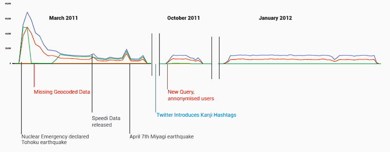
Fig. 1: Frequency of tweets in the archive over time. (Blue: total Tweets; Red: unique users; Green: geocoded tweets.)
The tweets fall into three sections: the first, starting a day after the earthquake (March 12th) and continuing for a month, represents the bulk of the tweets with two other blips: one for a week in October and the second in early 2012 making up the remainder.
3.2. Japanese Twitter
A curated archive such as this is not only a document of an event but also a document of Twitter conventions at a particular point in its history and in a particular part of the world.
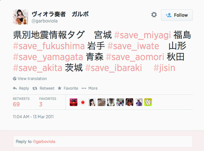
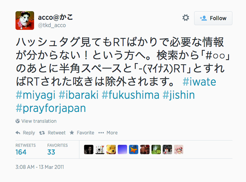
Fig. 2a: Screenshot of Japanese hashtag creation.

Fig. 2b: Screenshot of the use of whitespaces as separators between characters, enabling such things as word delimitation, keyword search, and automatic recognition.
Firstly, at the time of the disaster, hashtags in kanji were not recognised which meant that Japanese users often used roman hashtags, sometimes with a Japanese translation. In July 2011, Twitter rolled out hashtag support for Japanese, Korean, Chinese, and Russian characters (http://www.techinasia.com/twitter-hashtag-languages/), which meant that over time, we saw the beginning and rapid expansion of the use of Japanese hashtags in the dataset. This happened between the first month of tweets and the second dump. Secondly, Japanese words are frequently between one and three characters long (nouns are composites of Chinese characters), allowing users to pass on more information in 140 characters in Japanese than in English. This made co-word analysis or associational profiling difficult to implement.
In terms of hashtag development, a small number of twitter users (private persons, not institutions or government agencies) set up disaster-related hashtags to aid disaster relief: @garboviola in the screenshot above suggests using a set of prefectural earthquake information tags for seven prefectures. Similarly, user accounts intended to pass on disaster-related information were created for this purpose.
4. Results and findings
4.1. Hashtags
4.1.1. Co-hashtag analysis
Using co-hashtag networks, which show relationships between hashtags which are used together, we attempted to identify sub-issues, distinguish between different types of hashtags (event related, qualifiers, etc.), pointing out matters of concern to different clusters of actors. The nodes (hashtags) are colour-coded according to their modularity class, a value calculated with a built-in statistics function in Gephi that measures how well a network decomposes into modular clusters or communities. As such, it visualises sub-networks within the internal structure of the graph (https://wiki.gephi.org/index.php/Modularity). We divided the entire archive up into five time slices for which we visualized co-hashtag graphs in Gephi. For sake of brevity, we are only including the first and the fifth visualizations here.
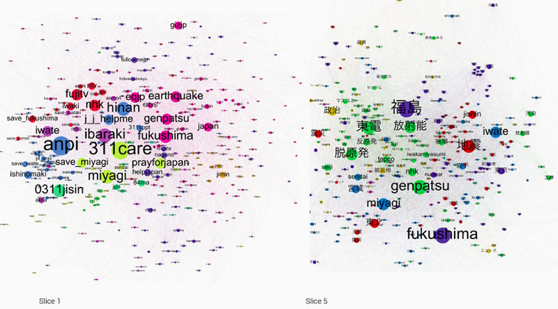
Fig. 3: Co-hashtag graph visualisations for slice 1 (1221 March 2011) and slice 5 (1 January 2012 10 March 2012) of the Fukushima dataset. Dominating nodes were filtered out so as to better visualise the middle range of nodes. (Spatialisation: Force Atlas 2; Colour-coding: modularity class; Filter: degree count range; Diagrams generated with Gephi 0.8.2.) (PDF, PDF)
As shown in the co-hashtag graphs above, we see a very obvious shift between the first one (slice 1, 1221 March 2011) and the last one (slice 5, 1 January 2012 10 March 2012), namely the emergence of Japanese language hashtags. The only Latin lettered hashtags that remain important in the latter slice are Fukushima, Iwate, Miyagi (all place names), jishin [earthquake] and genpatsu [nuclear]. Gone are the hashtags pertaining to requesting help (anpi, 311care, prayforjapan, 0311jisin), as well as those denoting media organizations (ntv, fujitv, nhk, tbs).
Substantively, the first hashtag graph is focuses on describing the disaster, and its immediate aftermath, especially where organizing help for disaster victims is concerned. In pink are hashtags pertaining to the disaster (eqjp [earthquake japan], earthquake, genpatsu, fukushima, japan), and in blue are calls for help (j_j_helpme, hinan [shelter], anpi [safety], etc.). The news media hashtags (here in red: for example, fujitv, ntv, tbs, nhk) frequently pop up when tweets link to news articles. In later tweets linking to news articles, content-related hashtags replace the names of media organizations.
The second cluster, about 8 months after the disaster, shows a remarkable development in terms of cluster topics and diversity within the clusters themselves. The hashtags no longer denote the events themselves, but discuss their political repercussions. There is a move from the event as a natural disaster, to the events social, political and economic repercussions.
Co-hashtags cluster around the natural disaster in distinct ways. Where in the first slice, the disaster-related hashtags were very descriptive (earthquake, genpatsu [nuclear], 0311jisin [3.11 earthquake]), in the second slice the disaster-hashtags have taken on political meaning and align with the political discursive landscape. While jishin and 地震 [both translate as earthquake] still cluster together in red, they also are close to place names, specifically Iwate and 岩手 [also iwate]. On the other hand, on the far left, we find the term 震災 [shinsai, which translates as earthquake disaster], in a cluster with government (政治 in mustard yellow) and anti-nuclear (反原発), as well as post-nuclear (脱原発).
Judging from the hashtags then, the discourse has markedly shifted from one of immediate rescue operations, to a political debate about the future of nuclear power (hashtags in green: 東電 [tepco], 放射能 [radiation], 反原発 [anti-nuclear], 脱原発 [post-nuclear], hibaku [irradiated], tepco, nhk, genpatsu [nuclear], seiji [government]).
However our analysis of the hashtags was potentially complicated by the fact that we did not know the query used.This meant that the centrality or emergence of certain hashtags could be in relation to the specific search terms or hashtags used to collect the tweets. Spikes in frequency could represent events on the ground or changes in data collection.
4.1.2. Reverse query analysis
We first considered whether we were dealing with a single query, or with evolving queries within the same (sub)set. Luckily, although we find that different queries have probably been used to capture tweets for the three different periods in the data set, it appears that each of these do not also mix multiple queries or methods of acquisition and storage. To ensure this, we have compared slices of the dataset before and after (large) increases in tweet quantity. This enabled us to distinguish between increases or trends causing the increase in data on the one hand, and changes in the query leading to more data on the other.

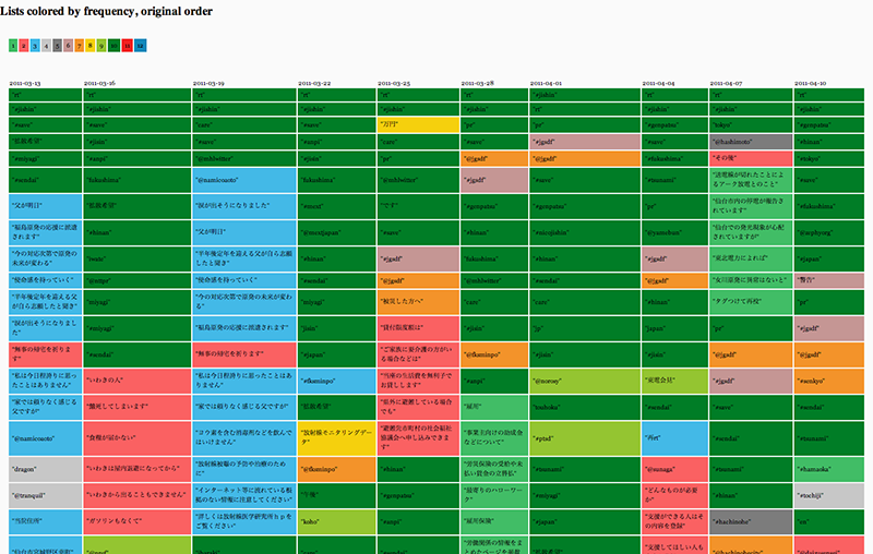
Fig. 4: DMI Triangulate (https://tools.digitalmethods.net/beta/triangulate/) tabular output. Rows are colour-coded by frequency of appearance across columns, columns are sorted by original order of input, i.e. frequency of word occurrence._
Figure 3 shows a triangulation of the most frequent words (any string of characters, including hashtags and users), colour-coded by frequency and presented in the original order of frequency. Each column represents a different slice of the fukushima dataset retrieved with a regular interval of three days (from left to right: 2011-03-13, 2011-03-16, 1011-03-19, 2011-03-22, 2011-03-25, 201-03-28, 2011-04-01, 2011-04-04, 2011-04-07, 2011-04-10), showing trends and deviations in captured frequencies. Given that the original query we have tried to reverse-design is necessarily (albeit in different degrees) represented in each individual slice, this triangulation helps identify the most likely candidate terms. For example, we were able to find out that the most commonly shared words across all slices that are also most frequently occurring are mostly broader terms such as #jishin [Earthquake] (http://tagdef.com/jishin), fukushima, #miyagi, or #save (sometimes appearing both with and without prefixed hashtag, which might be an artefact of the fact that non-latin characters such as Japanese hashtags were only algorithmically recognised as of July 2011). These results were then used as input candidates to iteratively build and test exclude queries against the actual dataset in the DMI-TCAT (http://tcat.digitalmethods.net/), exploring how much ground (quite literally) is covered with different combinations of terms. Frequency lists were generated with the filtered outputs to iterate the process of locating likely candidates. It should be noted that frequent and common terms such rt [retweet] were not used, for they are (probably) just device-specific artefacts of the Twitter capture.
_DMI-TCAT exclude query for spike 1:_
Rule Text: jishin AND save AND miyagi AND sendai AND jisin AND anpi AND 311care AND prayforjapan AND save_miyagi AND j_j_helpme AND earthquake AND tsunami AND japan AND genpatsu AND tokyo AND hinan AND care AND ibaraki AND nicojishin AND fukushima AND gizjp AND Japón AND Terremoto AND Pray4Japan AND eqjp
Start Date: 03/11/2011
End Date: 04/11/2011
Covered Activities: 533,381 tweets, 186.870 users
Remaining Activities: 79 tweets, 48 users
By means of a final step, we appealed to SIFTER (http://texifter.com/Solutions/SIFTER-2.html), a proprietary engine solution offered by Texifter to search social data provided by Gnip.com. As noted on the about page, SIFTER generates an email estimating the approximate number of tweets responsive to the query and the cost to execute the retrieval (http://sifter.texifter.com/Home/About). This estimate not just returns an indication of the market value of the collected dataset, but also of the estimated number of units (Activities) it should contain (34,213,000). In other words, we can infer to what extent the query matches or mismatches the corpus it should correspond to. Based on the estimate we can therefore assume the set has somehow been tailored to cover only Japanese territory (we observed there was extremely little transnational discussion).
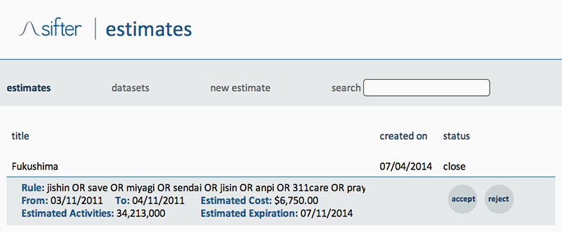
Fig. 5: Screen shot of a Texifter estimate for the derived Fukushima query, created on July 4, 2014.
_SIFTER estimate response for spike 1:
Rule Text: jishin OR save OR miyagi OR sendai OR jisin OR anpi OR 311care OR prayforjapan OR save_miyagi OR j_j_helpme OR earthquake OR tsunami OR japan OR genpatsu OR tokyo OR hinan OR care OR ibaraki OR nicojishin OR fukushima OR gizjp OR Japón OR Terremoto OR Pray4Japan OR eqjp
Start Date: 03/11/2011
End Date: 04/11/2011
Estimated Activities: 6,750.00
The total cost of accepting this job is $2,052.00
SIFTER estimate response for spike 2:
Rule Text: jishin OR save OR miyagi OR sendai OR jisin OR anpi OR 311care OR prayforjapan OR save_miyagi OR j_j_helpme OR earthquake OR tsunami OR japan OR genpatsu OR tokyo OR hinan OR care OR ibaraki OR nicojishin OR fukushima OR gizjp OR Japón OR Terremoto OR Pray4Japan OR eqjp
Start Date: 10/16/2011
End Date: 11/01/2011
Estimated Activities: 9,657,000
The total cost of accepting this job is $2,052.00
SIFTER estimate response for spike 3:
Rule Text: jishin OR save OR miyagi OR sendai OR jisin OR anpi OR 311care OR prayforjapan OR save_miyagi OR j_j_helpme OR earthquake OR tsunami OR japan OR genpatsu OR tokyo OR hinan OR care OR ibaraki OR nicojishin OR fukushima OR gizjp OR Japón OR Terremoto OR Pray4Japan OR eqjp
Start Date: 01/01/2012
End Date: 03/10/2012
Estimated Activities: 54,462,000
The total cost of accepting this job is $11,070.00
4.2. Users
To approach user distributions, we explored the most active and most mentioned users of the radiation sub-sample. Unusually, there are barely any bots among the most active and hardly any mention of any offline celebrities or global users. Most interesting is that all users tweet on-topic, the most frequent ones consist of governmental, personal and news actors, and users are mentioned more than they tweet themselves.
Table 2. Top users by tweets and mentions.
| Username | User Category | # of Tweets | # of Mentions |
|---|---|---|---|
| mextjapan | Government | 456 | 17,810 |
| FKSminpo | Fukushima | 889 | 9,740 |
| yamebun | Information | 253 | 8,435 |
| zephyorg | Personal-Business | 1,063 | 4,923 |
| shirou_s | Personal | 21 | 3,345 |
| NTTPR | Telecommunications | 25 | 2,279 |
| otomitv | Journalist | 212 | 1,941 |
| anpi24 | Safety | 121 | 1,613 |
| kenichioshima | Research | 1 | 629 |
| reichel0321 | Personal | 1 | 501 |
4.2.1. User interaction
Zooming into user interaction and mentions by creating user-mention graphs, it became apparent that within the first data spike, mentions mostly consisted of retweets and contained barely any original tweets. The dominance of retweets changes in spike 2 and 3 where mentions are comprised of both retweets and original tweets. The following two graphs show user-mention maps with and without retweets for the same time period, the first spike. Most interestingly, the main governmental actor @mextjapan (Japanese ministry of education, culture, science and technology) is mainly mentioned in retweets and is not addressed in original tweets, its messages are simply passed on, not contested or discussed. Only very specific actors are addressed in direct tweets, as is obvious from the map from the same time period only containing original tweets, where mextjapan does not appear.
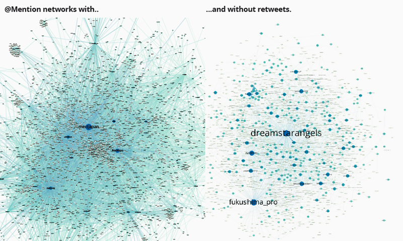
Fig. 6: Social graph by mentions network comparison including (left) and excluding retweets (right). (PDF, PDF)
Government information is thus rarely contested in this first month following the disaster. People are concerned simply with information sharing.
4.3. URLs
We also profiled the top URLs in the same manner, qualitatively coding them by categories like persona, radiation info etc. this helped contextualise what kind of information was being shared by users and through different hashtags.
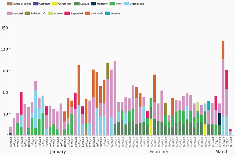
Fig. 7a: Top URL categories over time for third spike.

Fig. 7b: Top URL categories over time for second spike.
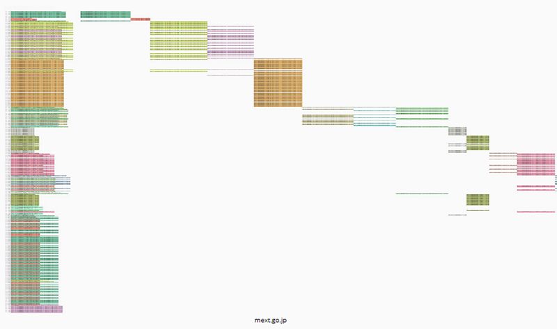
We then used the URL sequencer tool to profile how different URLs were disseminated by users. The tool works by first obtaining every share of a URL (in the full data set, regardless of sub queries) and then identifies repeated sequences of text (ignoring @ mentions and differently truncated URLs usually retweets and bot shares which are colour coded in the first column on the left and then assigned a column on the right in the order they first appear. This gives a rough idea of the rhythm and order of different types of sharing practices and how much commentary or blind dissemination there is. The below figure is a fairly typical URL in which small bursts of retweets appear in an ad hoc fashion, spread out over time. This is actually the home page of Mext and the bursts of retweets refer to different instances of information sharing, depending on what was on the homepage that day.

Fig. 8a: URL Sequencer tool output for mext.go.jp.
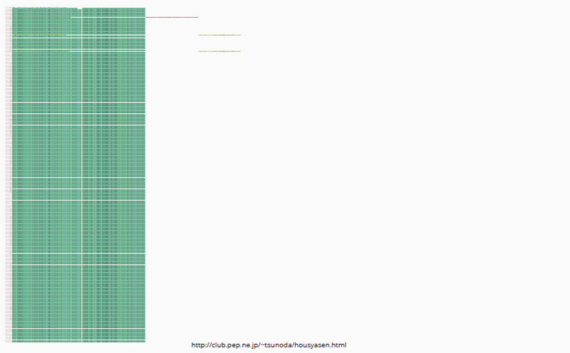
But in the JD archive, the below kind of formation was much more common: one monolithic block of retweets with a few original shares punctuating it. This confirmed what we had suspected in other analyses -- that users were sharing information but rarely engaging or critiquing it.

Fig. 8b: URL Sequencer tool output for http://club.pep.ne.jp/~tsunoda/housyasen.html.
But as time went on in the second and third data spikes, excluding the first month following the disaster we started to see more shares like the below. In this case there is very little retweeting and there are a staggering amount of variations on sharing which suggests more personal engagement and commentary. This link also represented a grassroots radiation victim website rather than a government source.
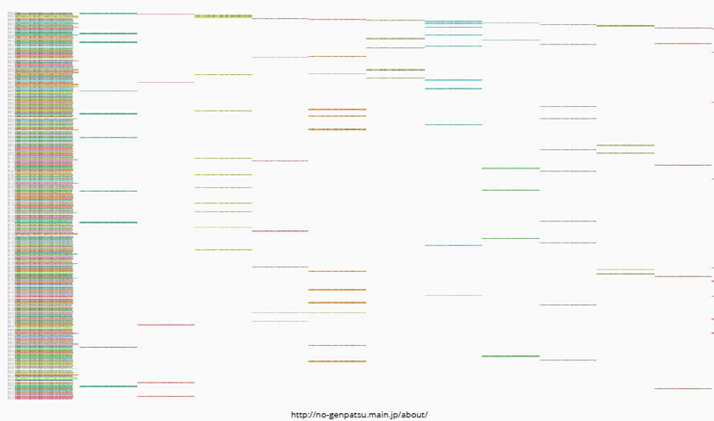
Fig. 8c: URL Sequencer tool output for http://no-genpatsu.main.jp/about/.
4.4. Radiation measurement
Having profiled the diffusion of information from the larger institutional actors we also wanted to compare this with the practices of lone individuals who were tweeting alternative radiation measurements.
Using a pattern matching system, we retrieved 1175 tweets reporting radiation measurements. 45 of the tweets contained Gray values, 988 Sievert values and 848 CPM values (a lots of tweets contained both Sievert and CPM values). Most of them came from automatic radiation monitoring devices, tweeting measurements on a regular basis. There was also a few user generated messages, and a significant number of retweets (both automatic and human messages).
For further analysis, we extracted the amounts of 35 measurement in Gray, 102 in Sievert and 133 in CPM. Below is the graph of these radiation measurements in the three different units over time. We can see a big difference between the tweets from the first month after the accident, characterised by important variations and some very high values, and the tweets from the later days, with more regular and low values, mainly generated by automatic users.
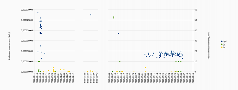
Fig. 9: Scatterplot of radiation measurement mentions in user tweets.
124 tweets of the tweets containing radiation measurements were associated with geographical coordinates. Using a dictionary of japanese cities names we managed to extract more geolocations, resulting in 495 tweets with at least one location. We tried to generate a map of the radiation measurement but the data were higly concentrated in a few locations (the center of big cities, see below), making the map difficult to read. This visualisation may be improved by using animations showing the temporal evolution of these measurements.
4.5. Bots
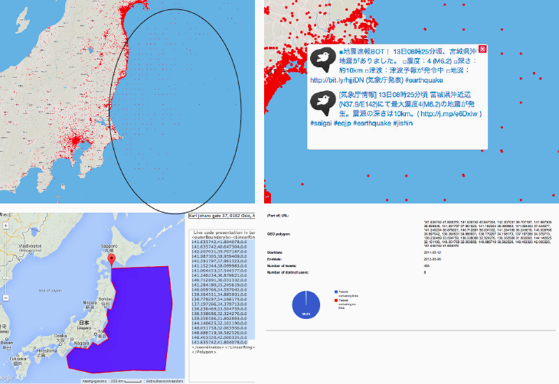
Fig. 10: Process of analysing offshore grid of bots tweeting automatically on seismic activity in regions in the ocean.
On the JD archive interface we noticed that there were some peculiar geo-located tweets located in the ocean and arranged on a grid. We discovered that these were in fact bots mainly one bot created by a researcher at a university which was sending out tweets about seismic activity. The bot was of course not physically located in the ocean but was referring to the measurements at those geographic coordinates. Below we used the cascade tool, which shows the rhythm of users tweets over time) to identify the sea bots which stand out by their tweeting patterns.

Fig. 11: DMI-TCAT Cascade output showing distinct user and bot tweeting patterns.
4.6. Geographic data
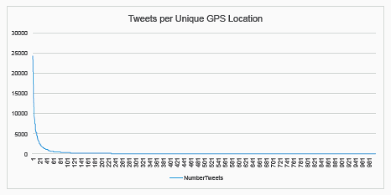
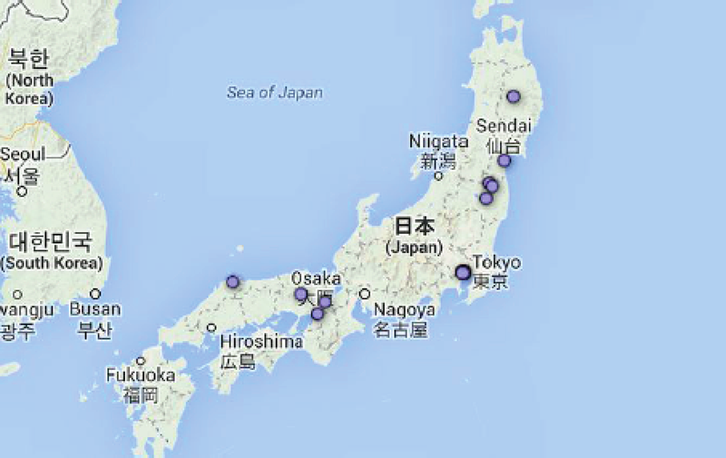
If it was the case that some geographic data was assigned to Tweets either by the archivers or peculiarities of Twitter, rather than gathered automatically by phone GPS data, then this would make a citizen maps of radiation Tweets problematic. When we initially tried this we saw that thousands of Tweets would be suspiciously be located at the exact same geo-coordinates in the centre of a city, suggesting that self-reported profile location was used to assign exact geo-coordinates. We found that 24,199 tweets came from one such point in Tokyo and 50% of geocoded tweets came from only 17 exact locations, shown below. But we also discovered that most of the tweets in identical locations were re-tweets of each other suggesting that the archivers (or Twitter) assigned the location of the original tweet to all its retweets, which changes the geographic distribution of the whole data sample completely.

Fig. 12a: Line graph of plotted tweets per unique GPS location.

Fig. 12b: Map of unique GPS locations associated with tweets.
Instead of attempting to map these precise geo-coded locations we instead decided to take a more subjective approach to Twitters construction of place. Since we had discovered a high proportion of tweets referring to specifica locales, we attempted to map these place mentions to their actual geographic location and then compare them with which hashtags were being associated with them. We extracted mentioned locations from the tweet text using a list of all cities with a population greater than 15,000 described by their names, alternative names, names in different languages The below map is a bi-partite map of hashtags and places mentioned in the same tweet, which are then nailed down to geo-coordinates. Using Force Atlas 2, the hashtags are then allowed to gather next to the places they are associated with.
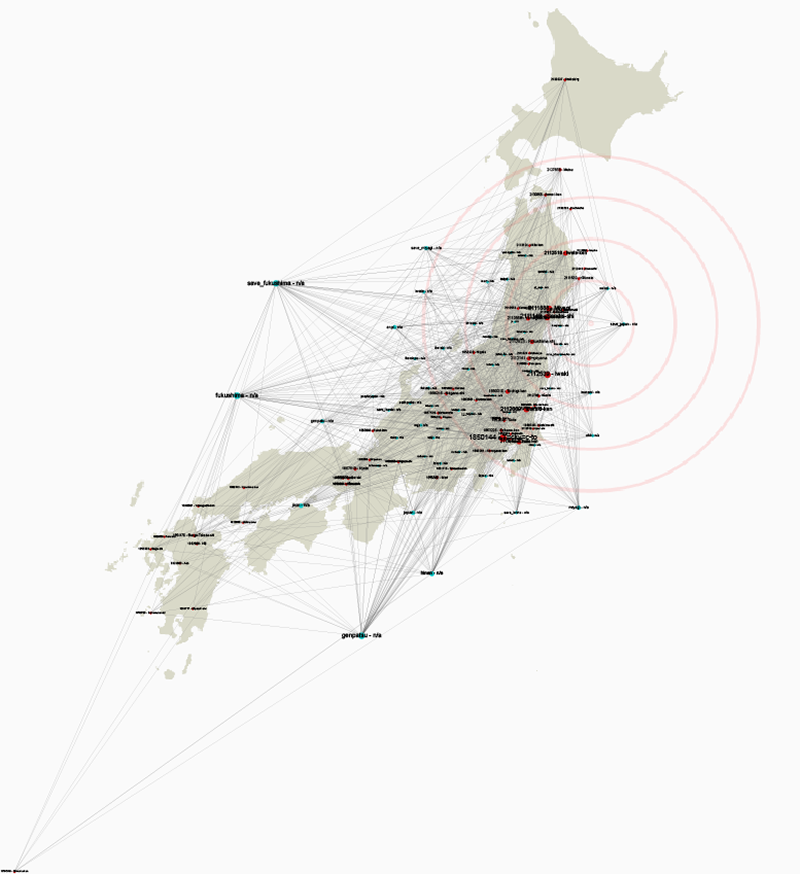
Fig. 13: Gephi Geolayout graph connecting hashtags to geolocations.
Although the findings were not very dramatic, the main hashtags referring to radiation and earthquake were associated with certain places rather than others, but these were not necessarily where the earthquake effects or radiation effects were most pronounced. The disaster was not particularly localised but was a nation wide concern at least in the immediate aftermath.
5. Conclusions
Archives like the JD archive are crucial for understanding past events through social media. We found that we can to some extent reverse engineer archives which we do not know the provenance of but it is important for the purposes of secondary analysis that archivers are transparent in the decisions they make so that some claims can be made about the representativeness or completeness of the archive.
We did find, through interrogating the archive, that in the case of Fukushima, Twitter is used mainly for dissemination of information, critique only came in later.
But geography became problematic in this regard because the archive is limited to the geographic boundary of Japan so we do not know if a different set of information was being fed in from outside. It is our recommendation that in future disaster archives we maintain a certain agnosticism towards a literal cartography and be more medium specific about the construction of place through cell phone GPs / self reported location / time zone or place mentions. Rather that locating the debate we should ask how location itself is an effect of the medium.
6. See also
The above has been presented at the Digital Methods Summer School. The slides of this presentation are available online: https://drive.google.com/file/d/0B3bPSQjoEYwjeEZleXFYV3hDSlU.
7. References
- "Twitter Capture and Analysis Toolset (DMI-TCAT)." Digital Methods Initiative. Web. https://wiki.digitalmethods.net/Dmi/ToolDmiTcat.


Ideas, requests, problems regarding Foswiki? Send feedback