Figures 1 and 2 provide two examples of the .gexf output for the query [aging]. In both figures the red nodes represent categories and the white nodes represent the individual items. If an item belongs to a particular category, a link is drawn. The node size is proportional to the amount of links a node is connected to (degree). For the sake of legibility, only the labels of the categories are shown. Figure 1 shows the classification mapping of applications for the query [aging]. As can be seen, applications can belong to up to three categories and are mostly about Health & Fitness and Lifestyle. The third cluster is related to Entertainment as well as Photo & Video. Counter-intuitive at first, these apps allow the user to age head shot pictures, e.g. by making someone look bold.
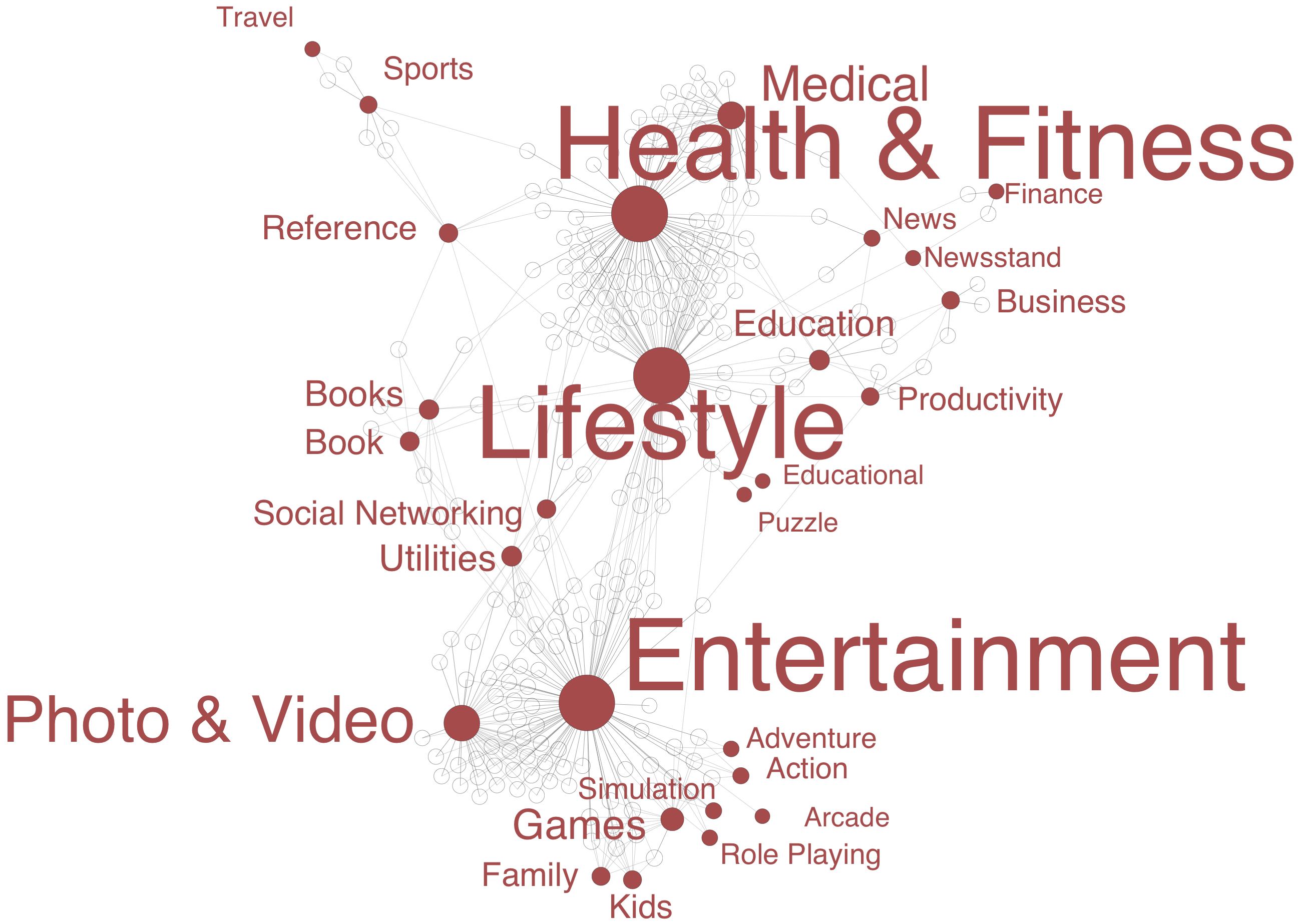 Fig. 1. Classifications mapping of the query [aging] for ios applications available in the US iTunes store.
Figure 2 depicts the classification mapping of podcasts for the query [aging]. In the iTunes store podcasts mostly belong to only one category. As such, the visualization can be read like a tag cloud. It is interesting to see that a different type of offering leads to a different description of ageing. Wile there is still a lot of focus on health it also becomes apparent that e.g. Christian podcasts often address the issue.
Fig. 1. Classifications mapping of the query [aging] for ios applications available in the US iTunes store.
Figure 2 depicts the classification mapping of podcasts for the query [aging]. In the iTunes store podcasts mostly belong to only one category. As such, the visualization can be read like a tag cloud. It is interesting to see that a different type of offering leads to a different description of ageing. Wile there is still a lot of focus on health it also becomes apparent that e.g. Christian podcasts often address the issue.
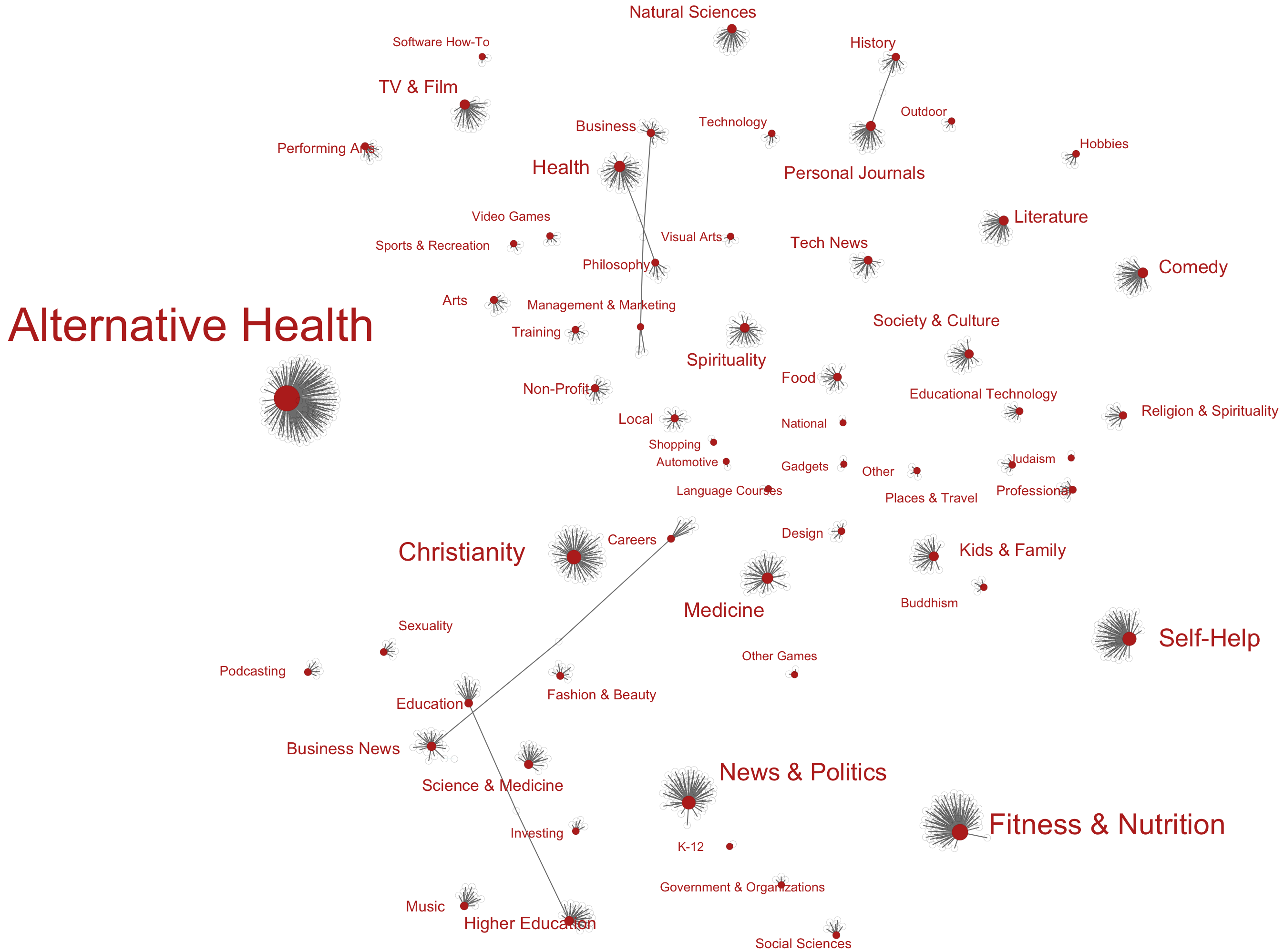 Fig. 2. Classification mapping of the query [aging] for podcasts available in the US iTunes store.
Fig. 1. Classifications mapping of the query [aging] for ios applications available in the US iTunes store.
Figure 2 depicts the classification mapping of podcasts for the query [aging]. In the iTunes store podcasts mostly belong to only one category. As such, the visualization can be read like a tag cloud. It is interesting to see that a different type of offering leads to a different description of ageing. Wile there is still a lot of focus on health it also becomes apparent that e.g. Christian podcasts often address the issue.
Fig. 2. Classification mapping of the query [aging] for podcasts available in the US iTunes store. This topic: Dmi > ToolDatabase > ToolItunesStore > ToolItunesStoreSampleProject
Topic revision: 11 Apr 2012, ErikBorra
Topic revision: 11 Apr 2012, ErikBorra
Ideas, requests, problems regarding Foswiki? Send feedback